PHOTOGRAPHY TIPS AND TUTORIALS FROM HURRICANE IMAGES INC.
POWERFUL INTIMATE VIDEOGRAPHY / PHOTOGRAPHY | www.hurricaneimagesinc.com

Friday, January 31, 2014

Day 19, Learning 19: Better Lightroom workflow

Selecting images is one of the more tedious parts of the process for me, so this learning got put to immediate use.  In Lightroom (my first stop for editing photos) you can use the Survey mode to select just the similar images from your shoot.


Now you've got a smaller group of larger images to view.  I delete my least favorite images, and give the others one star:

If I have a lot of images I try not to be too picky.  I go through all of my different sets this way.  And then I use the Filter function (lower right of screen) to view only the starred items.  If I still have too many, I repeat the process, giving the next "winners" two stars.  It's often easier to think in terms of eliminating the worst photos as opposed to selecting the best.  Whittle your way down....

Thursday, January 30, 2014

Day 18, Learning 18: Photographing Food


I'm not one to photograph my food.  Maybe twice while traveling in Turkey did I feel the need to document my nibbles.  Perhaps it's because there's an art to photographing food that takes care and an attention to detail I just don't have when I'm hungry.  But I'm not going to do a post on food photography without a picture of food, and I sure as heck ain't going to use a stock photo on a blog about learning.  So here's my breakfast. We'll talk about it later.

Before I get into tips for food photography I should point out that the selection of food-- it's colors and textures, the plate/napkin/silver-- is of first importance... almost as important as the careful staging of the food on the plate to make it look delicious.  That's an art I'm not qualified to speak to, but there are some tips for taking your images to the next level:

  1. Take time with  your set-up: the food on the plate, the plate and silverware, the table or background.  It's an "art piece."
  2. Back light the food at an angle (try 10 o'clock) and then fill with about a 1-2 stop difference so that you can see plenty of details in the shadow
  3. You don't have to shoot the whole plate to convey the food
  4. Shallow depth of field often works better
  5. Have "incidental" items like a glass of water/ice tea, or bowl to create an accent
  6. Incorporate cutlery in the image-- it brings the viewer/diner into the relationship-- pay attention to the reflections they create
  7. Food that glistens is visually appetizing; brushing a little oil onto the food can give it that glow.
So let's go back to my breakfast up top.  For this I used an inset window for my key light (behind) and tin foil as a reflector-fill.  What doesn't work about the image?  First off, it's pretty boring.  Corn flakes?  Come on.  Compositionally, it's a little difficult to discern what the "subject" of the photo is-- is it the cereal or the fruit?  The knife and fork should be pushed a little farther away so we can see them more clearly.  The blackberries aren't the best contrasting color; they're a bit dark.  You might also notice that the colors are a bit weird. It's not that way in the actual image-- BlogSpot messes with the colors when I upload.  Does anybody know how to fix this?  It's being bugging me since Day One.

Fine.  So what works about the image:  though the subject is unclear the composition is interesting.  The spoon brings the diner into the image and reflects nicely.  The blue bowl and napkin match each other, and contrasts with the cereal; and the brown wood table (in the original image) has a nice warmth to it.  And the corn flakes are organic.  Looks tasty.

post script:  okay, I figured out what was wrong with the color in my uploaded photos.  Apparently Google tries to "enhance" your image upon upload.  You have to uncheck the box in Google + settings.  Makes me wonder what that + stands for....

Wednesday, January 29, 2014

Day 17, Learning 17: Invisible People


Tired of pesky people cluttering up your landscape or architectural photos?  The old trick is to slow your shutter down to make anything that moves disappear.  And I mean sssslllloooooowww the shutter.  People moving at walking speed tend to disappear at about 25 seconds.  If they stand still for a moment they'll appear as smudges, then shadows.  In order to slow your shutter you'll obviously need a tripod, and in daylight a neutral density filter (probably around 10 stops). Open up the aperture and keep your ISO at 100.  With shutter speeds this slow you don't need to worry about remote triggers or delays.  I didn't think to use this technique on the photo above and wish I had (I was carrying a mini tripod in my bag anyway).  Images of the Aya Sofia mosque in Istanbul without people are fairly rare, and it would have been easy to achieve.  Consider this next time you're in a church or historic building-- don't crank the ISO in order to get the shot, drop it, prop the camera on something, and go for slow.

Tuesday, January 28, 2014

Day 16, Learning 16: To light meter or not

In modern photography it's tempting to say that light meters are an antiquated tool with little use.  Driven by my old-world fascination with them, I've struggled to figure out just where they fit in my work flow.  Why bother, you ask?  Just use your internal camera meter and let it do the work.

Consider the following scenario.... what looks better to a client:  taking out a fancy, mysterious and formidable looking gadget, metering their face, dialing your settings, and taking the perfect snap... or taking a snap, looking at the back of your camera, fiddling with the settings, taking another snap, staring at the back of your camera, and fiddling with the settings.  Looks a little different from the client's perspective, doesn't it.

But a light meter can do more than that.  You don't need to pull it out for every shoot, but here are some times when I think it holds an advantage:

  • High contrast locations
  • Shooting when there are 2 or 3 major light zones (for example, a portrait in the shade with the combined sunny and shadow background-- trees beneath the sky)
  • When you want to set up your lights before the shoot
  • When you want specific light ratios between your flashes

Are there other times when it's better to use a light meter than your camera's meter?  You tell me.

That's my old light meter above.  You don't need to drop $300 on a fancy meter, but you'll probably spend a $100 on a used one that can do both flash and ambient light.  My opinion: it's worth it.

Monday, January 27, 2014

Day 15, Learning 15: Posing plus size models


Working with your subject is one of the four major areas of photography expertise (whatever your subject is... people, architecture, food, dogs).  People who are heavier-set often avoid being photographed because they dislike how the pictures emphasize the parts of themselves they’re unhappy with, while de-emphasizing the parts of them they are pleased with.  And that’s the key to photographing larger people: find and focus on the parts of them they love.

I don’t want to make this a diatribe, but beauty and strength reside in many places in the human body.  There are a few “slam dunks” when it comes to these areas:  the eyes, and the smile.  But there are also plenty of other areas to explore.  And there are a number of ways to minimize the areas that the person doesn’t like.  So here are some guidelines and some tips:

Guidelines:
  • If you don’t want some part of their body in the image, don’t put it there.  Move in closer and crop it.
  • If you can’t exclude it, hide it: angle it away from the lens, or tuck it behind a door frame or couch arm.
  • If you can’t exclude it, shape it with light.  We’ll talk about that in the tips section
  • Resist the urge to photoshop it.  That can be offensive

10 Tips:
  1. Create space between the arms and the body.  Show the curves
  2. Position the face closest to the lens
  3. Keep the arms off the breasts and torso
  4. Arch the neck slightly up and forward
  5. Position the body so that it creates a V shape.  For example, sit them on a chair, put their foot on a stool, and cross the arms over their forward knee.  The crossing of the arms creates a V or hourglass.
  6. Shoot from slightly above the subject
  7. When standing, increase the angle so that it’s closer to being a profile shot (say 50 degrees rather than 30 or 40)
  8. When standing, cross the legs, or bend on leg towards the other.
  9. When posing with another person, tuck the larger one slightly behind the thinner so they keep the same “ratio of space” in the frame
  10. Ask them what parts of their body they like the best, and focus on them!

Sunday, January 26, 2014

Day 14, Learning 14: Er... squinching?


Hmm.  Okay.  If you're aiming for "cool" in your portraiture this Peter Hurley technique has (I'm embarrassed to say) about a 70% success rate in adding something.  It's Peter's new "thing," and he's been stumping it campaign style for the past month.  If you haven't heard about it yet, it goes like this:

You can add a bit of Hollywood cool or sultry to your look by squinting slightly.  It's really a half-squint: in a full squint you tighten both the top and bottom of your eyelid and it naturally pulls in on the side.  Do this in a photo and you're likely to be mistaken for a perv.  Squinching is really when you slightly tighten the lower eyelid.  This works best when the subject is looking directly at the camera.  Takes a bit of practice to know what you're going for, so grab a mirror.  Or check out this video.

I'm going to point out one of the major drawbacks of this technique which may get me flamed.  It makes everyone's expression exactly the same; it has no real personality, only faux personality.  That doesn't mean squinching doesn't belong in your bag of tricks or photo session.  After all, everyone feels anger, or detachment, or sexy from time to time-- this is a shortcut for conveying those emotions.  It's shortcoming is a woman may squinch at you when she's feeling sexy, but she's probably doing other things as well to convey how she's feeling, things that create a unique dimension to her personality.  Those things are lost in a shortcut.  But it's worth playing around with in a photo session, because sometimes manifesting something externally leads to its authentic emotion internally. Being a theatre director these are familiar techniques; perhaps I'll write a post about directing, acting, and posing....

Saturday, January 25, 2014

Day 13, Learning 13: Dodge and Burn with a color base in Lightroom


One of my biggest pet peeves with dodging and burning techniques is that it can may make your image look muddy and gray if you have a large area to address (say, lightening an eye shadow or darkening an over-exposed forehead).  But you can tint your adjustment brush with whatever color your desire.  Even better, there’s a trick for picking the precise color from anywhere on the picture... in fact, from anywhere on your computer screen.
  1. Select the Adjustment brush
  2. Click on the color box beneath the sharpness slider
  3. Click anywhere in the color picker box
  4. Then hold and drag to the point on your screen you want to sample.  It will same that color.

This isn’t the best technique for working with people/portraits, but it works great with landscapes and other images.

The color picker tool also works with the Graduated Filter. 

Friday, January 24, 2014

Day 12, Learning 12: Be your own second shooter


One of the challenging things about photographing a wedding or similar ceremony, is that like most of the audience you’re standing behind the action.  The bride and groom (or the bar mitzvah or whatever) are facing the priest/rabbi/whatever.  You can get partially around this problem by placing your back-up camera (you know, the extra camera you must have if you’re going to shoot a wedding or any one-time event) beside the alter, behind the officiant.  Use a tripod or mini tripod.  Set it to remote, and you can trigger it with your second best learning tool.  You have to set your remote timer to the maximum, or it will turn off the remote function.  On Nikons, this option is located in the C4 menu (Monitor Off Delay).  For the best results, use the widest lens you have, set the aperture high in enough to keep the desired area in focus, and switch it into manual mode so it won’t hunt for focus if the subjects are moving.  You can also slave a flash off the second camera if needed.
 
Want to see more of my images?  Visit my website at www.hurricaneimagesinc.com

Thursday, January 23, 2014

Day 11, Learning 11: Classical poses


There are some basic rules for “classical” poses for portraiture, and they naturally differ for men or women.

Women:

  • Angle the body away from the light, and then turn the face back towards it
  • If standing, shift the weight onto the rear foot
  • If seated, angle the knees 45 degrees away from the light and turn the head back towards it.  Sit them on the front edge of the chair, and lean them forward slightly
  • Keep the arms/hands asymmetrical, with the near hand higher so that the closest shoulder is slightly higher than the rear shoulder.  Remember to create diagonal lines with the arms.
  • If they have long hair, drape it towards the far side, or lower shoulder


Men:
  • Angle the body towards the light so it hits the chest directly (this is the opposite of the women)
  • Turn the head back towards the camera
  • Shift weight onto the back foot
  • Position the hands (on the hips, in the pockets, etc.) so that the far shoulder is higher than the near shoulder-- this is also the opposite of the women

There are plenty of subtleties to classical posing-- crossing the legs away from the camera if the woman is seated, the tilting of the head back towards the low shoulder if male, etc-- but these are the basics. 

In terms of lighting, the Loop pattern is the most common, with a fill about 1.5 stops lower and coming from on axis with the camera.  Naturally, a light meter is helpful in setting those light ratios....

Okay, so let's see how the image at the top of the compared-- hey, wait a minute....

Wednesday, January 22, 2014

Day Ten, Learning Ten: Golden ratios in Lightroom


Pretty much everyone is familiar with the Rule of Threes in photography.  And when you use the Crop Tool in Lightroom, it gives you an outline of the rule with which to crop your images.  But are you familiar with the Golden Triangle?  Or the Golden Spiral?  Lightroom is, and here’s a great tip.  Click on your Crop Tool, and then hit “O” (that’s the letter, not the number).  With each press you’ll cycle through each of the six Golden rules for composition.  Hold down the SHIFT key and hit “O” and you’ll change the orientation of the overlay.


The Rule of thirds is, in my opinion, the most useful.  But the Golden Triangle can be helpful in determining where to put your point of interest with the composition has a lot of diagonal lines. 

Similarly, the Golden Spiral is especially helpful when you have a lot of negative space, or empty space in your image.  Now go back to the image at the top of the post.  This isn’t the perfect example, because ultimately you’d like more of an angle following the arc of the spiral, but the top of the violin to the elbow/hand (continuing on thru the bow arm) accomplishes some of that arc.

This feature seems to exist from version 3 forward.  Kind of amazing what they hid away in the program, huh?

Tuesday, January 21, 2014

Day Nine, Learning Nine: Posing hands


Learning, I’m finding, tends to go in trends.  From yesterday’s exploration of posing the body, I’m going further to working specifically with hands.  Hands often look awkward on camera; they’re very complicated limbs.  So here are some more tips for working with models:


1.  As before, keep the hand and wrist relaxed (can’t emphasize that enough)

2.  Have them do something:  adjusting rings, bracelets, watches; twirling hair

3. Remember to create gaps with your hands as well.  Let us see through them

4. For women, keep the pinky side closest to the camera.  Never face the back of the hand towards the camera

5. When hands are one hips, lift the palm up so that its cupped; don’t let it sustain weight

6. Fingers on a hand should all point in the same basic direction.  Don’t “splay” them out

7. When hands are at the face, avoid actually touching.  It smears make-up and creates indentation shadows

8.  And finally, when in doubt, lift the forefinger like in ballet

Monday, January 20, 2014

The 2nd Best Learning Tool You’ll Ever Buy


I’m thoroughly convinced of this.  I wrote about the #1 learning tool you’ll ever buy here.  It costs about 5 bucks.  It’s not sexy until you make it sexy.  Mine’s getting damn sexy. 
 
The second best learning tool only costs a dollar more and you can get it here.  Or if you want the Nikon brand you can drop $24.  Yeah.  It’s a wireless trigger.

Why is this one of the best learning tools you can own?  Because you can photograph yourself with it.  You no longer need a model in order to experiment with lighting.  And when you work with yourself as the subject there's no rush, no anxiety. But there’s more:  if you are working with a model you can set your light levels before they arrive (provided you have a light meter... you do have a light meter, don’t you?).  And there’s more:  you can use it to reduce camera shake on long exposures.  Yes, you can use your camera's timer for all of these, but the wireless trigger reduces the wait time and takes the picture exactly when you want it. 

Day Eight, Learning Eight: 17 Tips for posing models


Remember when I wrote that one of the four areas of expertise was "the subject?"  For most photographers that subject is a human being.  In working with people, there are really two considerations:  how to position  physically, and how to position them in relation to the light.  Today's learning consists of 17 Tips for posing a model or client physically.  These points are adapted from Roberto Valenzuela presentation.  He’s a superb wedding photographer and you can find a Youtube video of him talking about his points here:

1. Keep the spine straight-- no slouching!

2.  Create as many angles with the arms and legs a possible for a natural pose, but avoid 90 degree angles unless the arm is resting on a surface.  90 degrees looks unnatural.

3. Give the hands something to do: hold an object, perform an action, tuck them into pockets, etc.

4.  Keep the hands and fingers relaxed and soft.

5. The origin of the fingers must always be visible (never have fingers peeping around a waist or over the shoulder).  If possible, make the whole hand and wrist visible.

6. Shift the body weight onto one leg for a more relaxed look.  If you want something more formal, put the weight equally on both feet.

7. Avoid mirroring the arms and feet.  Place one hand higher than the other, or the arm bent at a different angle.

8.  Avoid pointing the collar bone directly towards the camera.  Angle it away and turn the chin back towards the lens.  This is a guideline, not a rule.  Point the collar bone directly at the camera can be quite powerful, though less elegant and refined.

9.  The eyes should be the first thing the viewer sees.  There should be a direct line of focus towards them.

10.  Create gaps.  Let space be visible between the arm and the body.  If leaning against a wall, create a gap between the body and the wall (so that only the shoulder is touching the wall).

11. With couples, it’s safest to keep their bodies visible in equal ratios.  Don’t have either couple take up twice as much of the image as the other.  Angle the larger body, or “tuck” it behind the body of the other person so they are closer to being balanced. 

12.  Avoid having their noses pointed in the same direction (two profile faces, for example).  Instead, have them pointed slightly towards each other.

13.  Create points of touch.  The more places or points a couple touches (hands, foreheads, hand to cheek, etc.), the more intimate the image.

14.  Pose the eyes.  Tell them where to look.  Work with the eyes last (position their bodies first).

15.  Be specific in your direction.  It doesn’t matter if you’re working with a professional model or a “normal” Joe, people want direction and feedback.  Tell them "lift your chin, tilt your head back, and look at that tree." 

16.  Don't just tell them, show them.  Have them mirror your body, or use your hand to show the angle, point in the direction, etc.  Language is confusing and the last thing you need is a picture of a confused model.  But don't be afraid to verbalize what you're doing as well.
 
17.  After you have the pose set up, inject emotion into it.  Tell them to imagine such and such, make them laugh, etc.
 
These tips are slightly adapted from Valenzuela’s presentation.  He actually has 21 points for posing; these I found to be the most useful, but check out the video for yourself.  They are also non-classical or informal posing tips, though formal poses use many of the same principles.

Now let's take a look at the image in this post and compare it to the rules:


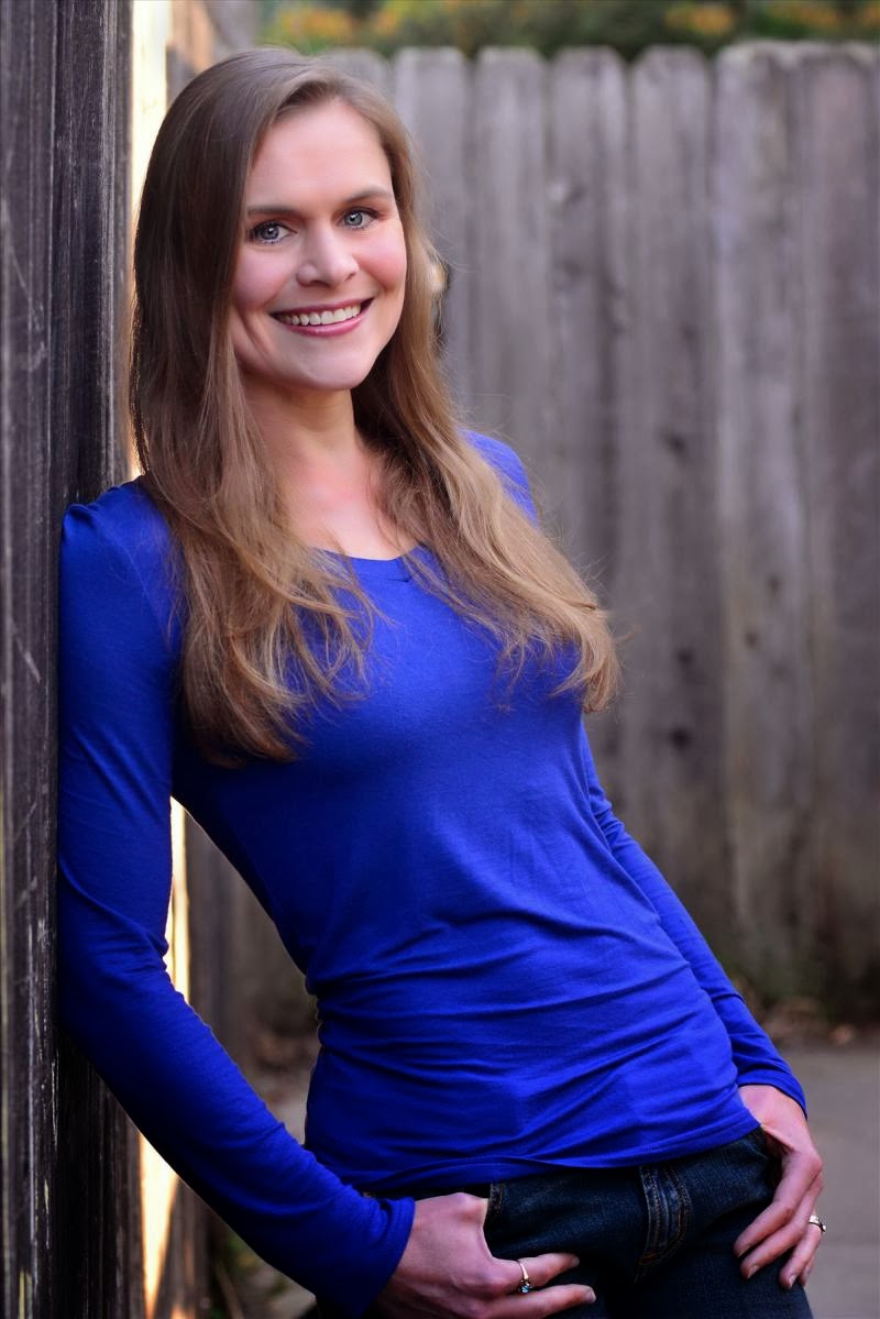
Spine straight, bent arms, no 90 degree angles, hands tucked, no amputated fingers, weight on one leg, collar bone pointed away from the camera, gaps beaten the wall and her body, eyes posed.  Is it perfect?  Well, I should have noticed the wrinkles on her shirt for one....

Sunday, January 19, 2014

Day Seven, Learning Seven: Aspect Ratios


Aspect Ratios.  This isn’t a particularly deep or sophisticated byte of knowledge, but I never really sat down to learn it, resulting in some irritation when I enlarged photos only to find the printer has cropped the image, making it unbalanced.  If you’re shooting with a DSLR or point-and-shoot, your aspect ratio is 2x3.  That’s how your sensor captures the image.  Thus your standard 4x6 print always looks right.  If you don’t crop the image in your post processing, this means you should enlarge your prints to the following sizes:


8x12
10x15
16x24
20x30

 
One thing to remember is that if you’re taking a photo for someone else (a client), and they want to enlarge it, they’re most likely to make it an 8x10.  For no good reason, that’s a standard size for photo frames.  So you have a choice: either shoot with extra room on the width of the photo, or educate them on how to buy the right frame.

Saturday, January 18, 2014

Day Six, Learning Six: Dodge/Burn on 50% Gray


In portraits this technique can be used to reduce unwanted shadows, or deepen them for a more dramatic look.  In landscape and architectural photography it can create more dramatic, dynamic images.  There are several different ways to Dodge and Burn and I’m planning on exploring them further, but lets start with the basics.

Dodging and Burning in Photoshop:  some folks will dodge and burn right on the image.  This is considered “destructive” editing because it changes the actual file.  If there’s just a little bit of work to do, it can be a quick way to get it done.  However, one of the problems with dodging and burning is that you’re essentially drawing black and white lines of varying widths and densities on your image, and these can make larger areas look kinda gray and muddy.  A non-destructive way which is a little more subtle, is to create a separate layer:

1.  Create a New Layer

2.  Fill it with 50% gray:  Hold down the Shift key and hit f5 and the box will appear (another way is to go to Edit, then Fill).  Select 50% Gray from the drop down menu.  Now you can’t see anything but gray.

3.  Set your Blend More to Soft Light or Overlay.  Now you can see your image just as it was before.

4.  Select you Brush tool.  Select a low Density or a low Flow (see below for more info)


5.  Paint on the gray layer using white to lighten, and black to darken.

6.  Dodge and Burn your image.

It’s important to keep your brush tool on either a low density, or a low flow.  By low I mean around 10%.  If you set your density to 10%, then the opacity of your painting will never go above 10%.  If you set your flow to 10%, it means your brush will paint 10% with each pass.  I typically set my Density to about 25%, and my Flow to about 5%.  This means I’ll apply 5% with each stroke, up to a total of 25% but no greater.
 
How to Dodge and Burn an image is too complicated and visual to explain in words.  Do a Youtube search for it.  Keep in mind that you can Dodge and Burn to reduce unwanted shadows, but also to increase shadows and highlights for a more dramatic image.

Challenge Yourself


If you’re reading this blog you’re probably interested in bettering your photography.  Maybe it’s a hobby; maybe you’re feeling ready to try your hand at a career.  Whatever the reason, here’s the best advice I can give you.  Do your own 100 Learnings in a 100 Days challenge.  Unless you’re already a working professional, the best way to improve your skills is to challenge yourself.  Don’t just read my blog, take it on for yourself.  Make it 150 learnings in 100 days-- after all, you’ll be getting a bunch of them handed to you on a plate in this blog.   

How am I going about teaching myself?  Youtube is great, especially for learning techniques in Photoshop and Lightroom.  There are some great websites and blogs for improving your skills: http://strobist.blogspot.com, http://www.luminous-landscape.com/index.shtmlhttp://www.cambridgeincolour.com, http://www.diyphotography.net/,  http://www.slrlounge.com/,  http://gavtrain.blogspot.com/, http://www.mccordall.com/photo/  are just a few of them.  If you’re one of those people who reads a lot of photography blogs, one of the great benefits is that this process will quickly point out which ones are truly educating and improving your technique, and which are really for entertainment value.

I’m finding that I spend about an hour a day “studying” and sometimes a little more.  One of my best tools is a notebook for writing down each learning.  Get a notebook.  That's a picture of mine-- it's sturdy and attractive, built to last for years.  Otherwise you might as well not be studying at all.  And go make better images.

Friday, January 17, 2014

Day Five, Learning Five: Classic Lighting


The Four Classic Lighting Patterns:  Butterfly, Loop, Rembrandt, Split.

There are four basic or classic lighting set-ups.  The terms refer to the shadow created by the main or “key” light.  In order to reduce the severity of shadows, there is often a fill light for the shadows, and a rim or hair light to help separate the model from the background.  I’ve ordered the light patterns here:

Butterfly:  the light is “on axis” with the camera, typically slightly above the camera at a 15 to 30 degree angle, but also right around the lens as circle light.


Loop:  Here the light is 15-40 degrees to one side of the model, and slightly above the eye line.  Go to high, and you create ugly shadows in the eye socket.  In Loop lighting, the shadow of the nose does not touch the shadow of the cheek.

 
 Here is an example of a fairly subtle loop lighting.  The shadow barely moves camera right; the flash is probably 15 degrees off axis.
 
Rembrandt:  now the light is 45-75 degrees to the side.  The shadow of the nose merges with the shadow of the cheek, creating a small triangle on the cheekbone.  Often the far side eye is in darkness.

Split:  This is light directly from 90 degrees to the side of the model and lights just half her face.  Sometimes you’ll see dual split lighting-- with the key and fill light to either side.
A little deeper into the classic light patterns:  Usually, the fill light is on axis for loop and Rembrandt lighting.  This allows for the most natural look.  Move the fill light to the side and it becomes more dramatic.

 Here's an example of Split Lighting from the sun:
 
You can see that the sun is just shy of 90 degrees... probably closer to 85, but his face is clearly divided down the middle.  Here's another, more subtle example:


This image is from a runway event using natural light.  She has a bank of windows camera right acting as the key light, and there's another set of windows behind me creating gradual shading on the left side of her face.

If this is new to you, set up your lights and practice.  See where the shadow falls.  Each face is different-- the height of the cheekbones and the depth of the eye sockets are huge factors in where, exactly, you can position the light.  Remember, you want to see a catch light in the eyes (preferably both eyes).

Thursday, January 16, 2014

Day Four, Learning Four: Skin Softening


I said from the beginning that this blog and my 100 Days of Learning Challenge was going to be specific to what I needed to learn, which is inextricably linked to the equipment I use.  So a little bit about what to expect, and then on to the learning. 

I’m a Nikon shooter.  I have a D600 and use a D7000 as back up. I love ‘em.   I own more lenses than I should, three SB-800 flashes, and a variety of light modifiers.  Maybe I’ll write about equipment later.  On the software/editing side I use Lightroom 3.6 and Photoshop 6.  Probably I should upgrade those....  And I work on a PC.

Which leads me to learning four, which is a technique for skin softening in Photoshop.  There are several ways to soften skin, and they each have advantages and disadvantages that make them more or less useful, depending on the image.  Here’s one way:

1.  Duplicate your image by dragging to the New Layer icon at the bottom or pressing ctrl J (or Command J on a Mac).

2.  On the new, top layer, go to Filter - Blur - Surface Blur.  Name your new layer Surface Blur.  Your Layer Adjustment panel should look like this:


3. Set your Radius between 3 and 5 pixels.

4. Set your Threshold between 14 and 24.  Your Filter box will look like this:
 
Notice how it's overly blurred?  That's fine, because we're not going to apply all of that blur.  So go ahead and--

5. Press Okay

6. Apply a new Layer Mask by holding down the Alt key and clicking on the Layer Mask icon.  This creates a black layer mask.  If your mask is white, you can click on the mask, hold down the Alt, and hit your Backspace key to turn it black.  This hides the surface blur you just applied

7.  Select your paint brush, make sure the color is set to White, and paint over the skin area of your model.  Avoid the edges of the skin, nose, lips, eye lashes, etc.  You want those sharp!  You should be painting white on the black layer mask.  Only the painted areas will have the surface blur applied to them.  Also, it’s best to reduce either the Density of the Flow of the brush in order to have control over the results.  I used a Density of 65 and a Flow of 15.

When it looks the way you want it to, flatten the image and you're done.

Wednesday, January 15, 2014

Day Three, Learning Three: Shooting Runway Fashion


Tips for shooting fashion runway models:
 

There are three basic shots in Runway photography, plus a couple of extras.  The three basics are:

            * Full body shot, with the front foot flat on the floor

            * ¾ body from above the knee to the head

            * Head and shoulders
 
 Full body, front foot flat on the floor

That’s it.  Nail those three and you’re doing alright.  Of course, it’s a bit harder than it sounds because the models are moving pretty quickly, the lighting can be difficult, and there are no second chances.  Plus, many show producers want you to capture those three for every outfit, so there’s very little time to look at the back of your camera to see if your settings are correct. So a few more tips:
 

  1. Get there early and stake out your spot on the floor.  Try to be at the end of the runway so they’re walking directly towards you.
  2. Zoom lenses work well on Runways.  Use a 70-200 if you have it.
  3. Put your shutter speed between 125 and 325 depending on your lens (longer lenses will need faster shutter speeds)
  4. Put your aperture between 2.8 and 5.6 to blur out the background.  If your camera is having trouble focusing quickly (or your images appear slightly blurred), increase your aperture setting to have more depth of field. 
  5. Time your shots off of the music in order to capture their front foot flat on the ground.
  6. Some shows allow flash photography, some don’t.  If you can shoot without flash your images will have better depth and dimensionality.  Your flash recycling time may also be slower than you need.
  7. Bring water.  Shows can be tiring.
  8. Typically there’s not room for a tripod, but many photographers bring monopods.  This helps if you’re shooting with a big lens.
  9. Experienced models will take their moment at the end of the runway and look you right in the lens.

Okay, about  those extra shots:  after you nail the full body, ¾, and headshot, try to capture a couple of close-ups of their accessories:  earrings, necklaces, belts, shoes.  Many photogs forget to shoot an image of the model walking away.  Designers spend a lot of time making the back side of their outfits look good, so don’t neglect that shot.

Want to share a tip or offer a different perspective?  Please, write a comment!


Tuesday, January 14, 2014

Four Areas of Expertise


As I delve deeper into my 100 Day journey, I’m beginning to understand that there are really four major disciplines to mastering photography:  the camera, light, the subject, and the editing.  The first three overlap in significant ways, of course-- shutter and aperture affecting light; the subject in relation to light-- but at the same time they are distinctly separate, independent.  To gain control over your craft, you must have expertise in all three, so these 100 days, and the posts that follow, will explore all of them.

Day Two, Learning Two


Yesterday I wrote about Sunny 16 and the relationship between f-stop, shutter speed, and ISO.  If you shoot with a DSLR you probably already know this next bit (I understood it “generally”).  But it’s really the basis of so much of photography that it bears re-visiting.  Because you really must have this concept at your fingertips.

Reciprocals.

A reciprocal in photography is how the aperture, shutter, and ISO relate to each other in terms of f-stops.  An f-stop is the doubling or halving of the amount of light recorded on your camera’s sensor.  With shutter speed it’s simple:  double the shutter speed and you’ll half the amount of light.  So a shutter speed of 400 allows half as much light to reach sensor as a shutter speed of 200.  ISO is equally simple, only in reverse:  an ISO of 400 allows twice as much light to be collected on the sensor as an ISO of 200.  So:

Shutter speed of 200 + ISO 100 is exactly the same exposure as Shutter Speed 400 = ISO 200.  The shutter allowed half as much light to reach the sensor, but the ISO allowed double the amount of light to be recorded.  Apertures work on the same principle, only the numbers are a bit whacky.  In order to double the light:

Aperture f/1.4, f/2, f/2.8, f/4, f/5.6, f/8, f/11, f/16, f/22, f/32.

Each one is a doubling of the amount of light that reaches the sensor.  Each step is called a “stop” of light.  Notice that every other number is double: f/2 becomes f/4 becomes f/8 and so on.  Likewise, f/1.4 becomes f/2.8 and so on. 

Which brings us to the answer to yesterday’s quiz:  On a sunny day where f/16 at Shutter Speed 100 and ISO 100 will produce a perfectly exposed picture... in order to shoot at f/5.6 you’ll need to increase your shutter speed to 800.

Exercise:  Snap a picture in any mode you like (Manual, Aperture Priority, Shutter, etc.).  Check the settings and switch to Manual Mode.  Play around with adjusting our aperture while compensating with the shutter.  Do it without checking the exposure meter in the viewfinder.

Reciprocals are the basic building blocks for mastering photography.  But I promise the rest of my 100 learnings won’t be so technical.

Monday, January 13, 2014

Day One, in every way


This is day one of the 100 Blown Highlights Blog, but also Day One of my 100 Day Challenge.  I started this challenge because as a photographer I realized that I wasn’t growing as much as I wanted to.  Two simultaneous things gave me pause: the first was the realization that I was producing images that were being used professionally-- as CD covers, brochures, corporate headshots, and even the cover of a print magazine.  The second was that I didn’t feel that I could reliably produce a professional image on demand.  I understood the craft well enough to produce the great images, but not well enough to be consistent.  Truthfully, I was better at putting my camera in front of great subjects than creating them myself.  It was time to take my skills to the next level.

I decided that I would learn one new thing about photography every day for 100 days.  And I’m sharing them with you.  That’s the structural skeleton of 100 Blown Highlights, though I’ll probably include bits and pieces of other photography-related stuff.  Whether this blog will continue after 100 days is anybody’s guess.  It’s gonna be a lot of work just getting a 100 posts out there.  On top of the learning.

The skill level of these "learnings" is going to be Intermediate to Advanced.  This isn’t a tutorial-- it’s not going to be a step-wise, highly organized seminar on how to improve your photography.  Because this is about my learning... filling in the gaps and shadow areas in my own understanding and skill set.  But I hope, and trust, that it will be helpful for expanding other people’s skills as well.  So let’s get started.


Day One, Learning One:


The Sunny 16 Rule.  Some folks would consider this a beginner’s concept, but to be honest I’d only heard the term; I never really understood how it was useful.  Maybe it’s the same for you.  So I’ll start with a pop quiz:  it’s a sunny, clear day and you're shooting in Manual Mode in the sunshine.  But you want to shoot at f/5.6 not f/16.  What do you set your shutter speed and ISO to?  If the answer isn’t at the tip of your fingers, read on.

The Sunny 16 Rule states that on your average sunny day, if your f-stop is 16, your shutter speed and ISO will be the same.  For example: f/16 + Shutter Speed 100 + ISO 100 equals a perfect exposure.  Example Two:  f/16 + Shutter Speed 400 + ISO 400 equals a perfect exposure.  The shutter speed and the ISO always match up.  Go outside and see for yourself.

Honestly, this isn’t all that useful a rule, but remember two things:  every professional photographer knows and understands this rule; and it starts you thinking about the relationship between aperture, shutter speed, and ISO.  In order to apply the rule you need to understand how these three work together not just intuitively, but mathematically.  More on that to come.