PHOTOGRAPHY TIPS AND TUTORIALS FROM HURRICANE IMAGES INC.
POWERFUL INTIMATE VIDEOGRAPHY / PHOTOGRAPHY | www.hurricaneimagesinc.com

Showing posts with label Fashion Photography. Show all posts

Monday, May 18, 2015

The Wear Your Love Sessions


Photography and video production for artisans and artists


It’s good to connect with start-up companies-- I think they understand the value of imagery more than established companies.  For one, they have less to lose and are willing to be more adventuresome, and more flexible.  Jillian Leigh with Wear Your Love is exactly one of those companies.  She creates gorgeous boutique wedding dresses.  The style is simplicity and elegance.  For our shoot, Jillian wanted the dreamy quality of the beach and I suggested China Beach in San Francisco.  I picked it for  the granite cliff that would provide both a middle-toned background, and shade in case the sun was shining. 

Step back for an environmental portrait and you’ve got a stunning background as well.

Photography and videography production in San Francisco Oakland

It’s challenging to have your images rise above the competition-- which is exactly the point in marketing.  Emotion is one quality that can give your pictures a boost, but it’s not always easy to manufacture-- especially if you’re working with a solo model.  Research is what every working photographer should fall back on.  Jillian shared some of the images that inspired her; I studied the work of other “bohemian wedding dress” sessions; and I plotted out the sun’s travel with The Photographer’s Ephemeris, an online tool.  I reviewed my own images as well, and packed my bag accordingly.

I have an deep-seated fear of beach shoots.  The sand gets everywhere-- the reflections, the wind, the beachcombers... they're all difficult to manage. Which is part of what attracted me to the shoot.


The images were shot almost entirely in natural light, and mostly (because the day was overcast), without even a reflector.  The majority was shot on my trusty Nikon D600 with either a 35-70mm f/2.8 or my 80-200mm f/2.8.  A number were shot with a Pentax 645D and 45-80mm f/4 lens.  


Romantic unique wedding photography

On the second day of the shoot, Jillian’s boyfriend joined as a model, which revived some of the energy from the first day.  You can see more of the images we created at Hurricane Images, Inc.

Wednesday, April 15, 2015

Pleasant Surprise with the Ice Light Alternative


I have no doubt the folks over at Wescott won't be pleased with me, but then I'm sure they saw this coming.  With any popular new "invention" in photography, it's inevitable that a Chinese knock-off version will appear (let's face it, most of the original versions are made in China anyhow).  Over the past few years, Chinese manufacturers have seen the benefits of making these knock-offs with quality in mind, and become savvy at avoiding copyright issues.  So how does the "Magic Tube Light"-- or MTL 900 II-- compare to its $450 progenitor?  First off, I bought mine for $115 shipped.

I'll start by admitting I've never handled Wescott's Ice Light, so a direct comparison is unfair.  But light has it's own baseline for comparison, and that is something we can examine.

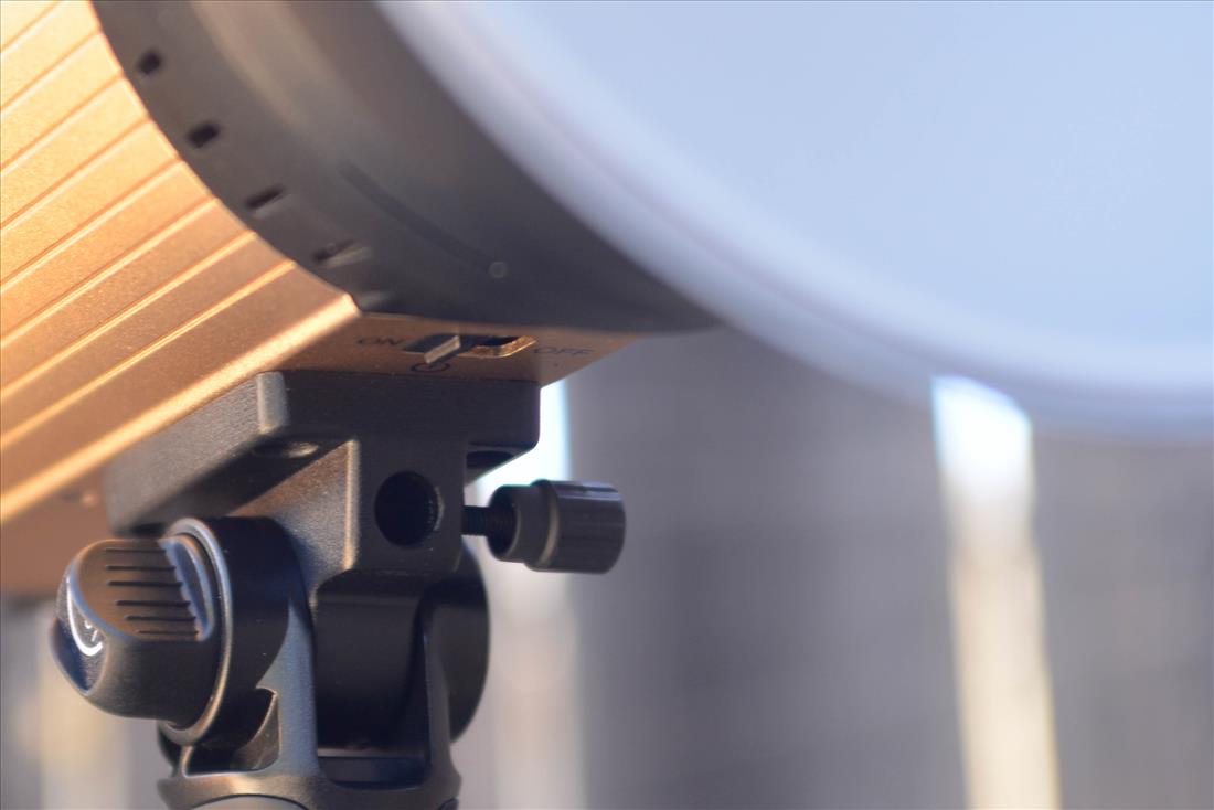
Superficially, the Ice Light is considerably more handsome.  The MTL 900 II (marketed under various names) looks a little plastic-y, and it is.  But it has surprising heft in the hand and feels well-built. The 1/4 inch screw mount on the bottom is the one component that gave me pause.  I'd rate it a 7 out of 10 in terms of sturdiness.   I expect, though, with care it will hold up just fine.

The MTL 900 is approximately the same size as the Ice Light (IL).  It has 298 LEDs compared to the IL's 72.  Obviously, the LEDs are individually weaker, but together they produce 1600 lumens of daylight balanced light.  The original Ice produces 1200 lumens, and the updated version II produces 1600.  Both units are dimmable, with a 73 degree angle of light.  The angle and quality of light the MTL 900 produces is similar to a gridded 24" softbox: you have to keep it close to your subject, so the light is soft with a bit of directionality or bite.  Both brands will last about an hour at full brightness.

While the Wescott is clearly superior in terms of looks and finish, our Chinese friend has a couple of advantages over the Westcott.  The most important is the battery-- it uses a common rechargeable Sony battery that costs about $10 on ebay. You can buy a couple and have hours of working light.  The MTL also comes with a remote, which while handy you'll probably never use.

If all this sounds exciting, there's a very important caveat and it applies to both the $450 Ice Light and it's $120 Black Sheep: the amount of light and what that translates into in real life.  1600 lumens isn't a lot.  In real-world terms, with the MTL 3.5 feet from the subject, my camera settings are shutter 125, aperture f/5.6, and ISO is 500.  Obviously, you can open up your lens farther, but for single portraits the depth of field is already pretty shallow and for couples anything less than 5.6 is a hazard. It's also a continuous light, which means that balances room ambient and key light is difficult given how little power you have to work with.  Both the Ice Light and the MTL are best suited for indoor/studio and night time portraiture, and perhaps a little punch or fill outdoors during the day.

Limitations aside, I was pretty impressed with the MTL900 II-- enough that I immediately purchased a second unit and a pair of barn doors ($30 for the knock-off version versus $40 for the Wescott).  Indoors, the light is small, quick to set up, and can produce some lovely light.  The barn doors add great functionality, and the quality of light is interesting.

A couple of little quirks:  you can run the MTL on AC, but if the battery is low it won't go to full brightness until it recharges to some unspecified level.  The amber, 3200k filter is a nice additional, but it would have been so much smarter to have the piece half clear, half amber so that you simple rotate the filter rather than remove.


What's it look like in action?  Here's a portrait done with two MTLs (positioned above and below as you can see in the catch lights).  The lights are on stands with ballheads positioned for the horizontal.  It's a two minute set up and knowing the amount of light it produces (and thus my camera settings) the first shot was a keeper.


Thursday, October 23, 2014

Musings on the Death of Photography


I can’t think of one art form that has died; perhaps this is because art, by definition, depicts an enduring aspect of the human experience. I have no worries that photography will be the first to perish.  But there is something gnawing at its soul that I find intriguing.  A few things, actually.

Photography is probably the most accessible “art” form we have.  Everyone takes pictures.  Many, many people play an instrument, but it’s unlikely that you’ll record your friend or family member’s playing and listen to it daily.  We do that we photographic images, though.  Our walls and refrigerators are plastered with photographs, most of which were shot by amateurs.  It’s an art form whose price of entry is almost nothing, which makes the price of being “exceptional” very high.  The talent, equipment, and dedication required to rise above the ocean of camera-wielders is astounding.  

And it’s a spectrum: Aunt Sally’s images blend into the enthusiast’s, which blends into the talented professional, which blends into top 2% of photographers.  This blending makes it difficult to evaluate and critique, two necessary conditions of any art form.  That’s a nibble, I think; a gnawing.

So many photographers, working on so many levels, makes it difficult to find paid work: full-time photographers are undercut by part-timers who will do the job at half the price; part-timers are undercut by Freebies.  All of this is being discussed endlessly and hopelessly.  The unspoken challenge is that less work also means slower improvement; even the best photographers improve by virtue of working. 

Unlike ever before, artists are working in an environment where “free” is a common price point.  There’s free music on the internet; free books in the library; free news; free concerts; free performances; and apparently “free” (but often stolen) images on the web.  And when things aren’t free they can be “bulk rate.”  Netflix gives you unlimited movies for a monthly, bulk fee.  “Free” art is less common among artists who produce a physical object that can be hefted around your apartment—like a painting or sculpture; but if it can be turned into something intangible—a song, an image, or a movie—then there is a growing expectation it can be had for free.  Munch-much goes Death on the ankle of Photography.

The accessibility of photography also leaves us drowning in images in a way that has never happened in the history of our or any other art form.  Our hard drives are clogged with unprinted and forgotten images.  I worry that this surplus devalues truly exceptional images.  My mother passed away last year, and each of the limited number of photos of her are a treasure.  I don’t think I would feel so attached to them if I had inherited a hard drive with a thousand images.  Worse, I don’t think those few would have stood out in a sea of mediocre images. Historically, painters have had the same complaint of museums: hang a work of art next to twenty other paintings and what do you get? A mind-numbing experience.  I can think of few things more chilling than my work contributing to the numbing of the public’s response to photography.  Munch-munch.

On the bright side, there has never been more of a demand for images.  With the internet, we live in an increasingly visual world. This means opportunity for more money, creativity, and excellence.  Two forces are clearly at play here.  How will we navigate them?

Monday, September 15, 2014

Day 87, Learning 87: Getting the camera to focus without hunting


I love my SB800 flashes.  I have three of them, all purchased used, and I rue the day one of them finally conks out on me because frankly, I don’t think Nikon has improved upon them with the 900 series.  Both of these top end flashes do something more than illuminate your subject.  You can use them to assist your auto-focus, even when you don’t want to use flash photography.

Even the best lenses will start to hunt back and forth for focus when light levels get too low.  Cameras focus based on contrast (which is why it will hunt when pointed at a brightly lit, but blank surface).

SB 800s and 900s have an “AF Only” (located in the AF Menu on the strobe itself) that turns off the flash.  It works best when your focus mode is AF-S, or “Auto Focus Single Servo” mode.

So the next time you want to engage in some available, low-light photography but need the auto-focus to work without hunting, give it a try.

Friday, September 12, 2014

Links Friday: September 12, 2014

This week's offerings:  Ever try to make a High Key portrait with just one light?  Martin Ziaja at Lighting Rumours shows you how.  Scott Kelby's Crush the Composition video, an hour-long presentation, started my foray into video learning; worth checking out.  "Defraction" is one of those concepts most photographers put off learning.  No better teacher to turn to than Cambridge in Color for an in-depth understanding. Serge Ramelli is one of the savviest indoor architectural photographers I know.  This video covers the basics to advanced techniques.

Tuesday, September 2, 2014

Nicefoto 680W Strobe Review: An inexpensive, muscle-bound, wireless strobe


I pretty much never review products.  Mostly, this is because I rarely buy the newest, hottest gear.  I’m a big fan of top quality goods that are already a generation old:  my bag is stuffed with gems like Nikon 80-200mm f/2.8, the 35-70mm f/2.8, and SB800s.  But I’m making an exception today, both because the product is fairly new, but also because I think it’s an exceptional deal.

I posted earlier about lighting alphabet soup, which was essentially a summation of my purchasing criteria.  I wanted a bigger strobe than my SB800s, one that could compete with the sun outdoors.  I settled on the Nicefoto 680W.  “Nicefoto” isn’t the most confidence inspiring name to emerge from the smoky factories of China, but I’d read some good things about it and the specs were excellent.


The Nicefoto 680W is equipped with a rechargeable battery that other reviewers have found to get 400+ flashes at full strength. It comes with both an optical trigger and a built in 2.4GHz radio trigger.  The power goes from full to 1/64 in full stop increments.  There’s a modeling lamp, and cooling system.  And it utilizes IGBT technology, which means the flash has a very short T.1 time (up to 1/7,900th of a second) for freezing the action.  Great specs, and at $420 a good price, but how well does it perform?


Features and Build
First, 680 watts is blindingly bright.  There’s more than enough power for most people.  The unit is built very well-- very sturdy, well thought-out, fairly heavy, and all the parts fit together snugly.  It feels, in short, muscle-bound.  The Nicefoto has a host of thoughtful little features, too.  There’s a handle that folds down for your human light stand, and a hole with tightening screw for attaching to a non-human light stand. It also has a second small handle that flips out from the top to make it easier to hold while attaching to said stand. There’s strap, a cold shoe to clip your radio trigger, and trigger input.  The LCD is large and bright, and the button-interface simple. The only misstep in the design is the umbrella holder, which is at the top of the handle. The reflector and the umbrella post collide, making it impossible to use both at once.  

Considering how much thought went into the rest of the unit, it’s baffling and there’s no elegant work-around.  The reflector is a Bowen mount, though, which means there are plenty of attachments available (including reflectors with umbrella holes).


Both the optical and radio triggers work well.  It would have been nice if you could control the output from the trigger.  Another odd over-sight.  The trigger appears to be universal (it works on both my Nikon and my Pentax) and has a pass-through, which is a great bonus. I can control my other strobes from the camera. The simplicity makes it easy to use, quick to set-up, and really a joy so far.  The modeling light is decent for checking your shadows, but too weak for anything else; it’s daylight temperature, just in case 35 watts is enough for your project.

Quality of Light
Independent testing by the folks over at www.lightingrumours.com verify that the color temperature is 5600; it rises to a slightly bluer 6300 as you decrease the power to 1/64th.  That’s pretty accurate in my book.  Recycle time is about 4.5 for a full pop, and the output is consistent.


Like your hotshoe flash, the IGBT flash times shortens as the power decreases.  In regular mode, the flash time decreases from 1/320th  at full to 1/7,600th of a second at 1/64th power.  There’s a FP mode for that clips it even sharper-- again with a commiserating loss of power.  There are five FP settings, the slowest (1/2000) is equal to about ¼ power.  The fastest (1/7,500) is pretty dinky.  Here’s the confusing part for me.  In my initial tests, the FB mode doesn’t appear to be any faster than the regular mode:  at ¼ power the flash fires at 1/1,600th of a second in regular mode.*  That’s virtually the same as the FB mode.  The FB mode appears to be a placebo for the most part, but it’s hard to complain because 1/7,500th of a second is very fast.

You’ll notice I haven’t mentioned HSS, only FB.  These two terms have merged into something synonymous and they’re not.  Frankly, I’m not sure what FB refers to anymore.  The 680W has an FB mode designed to reduce the flash duration.  HSS, on the other hand, greatly “lengthens” the flash duration by turning it into a serious of rapid pulses.  HSS is slightly more useful because it allows a faster shutter speed, thereby reducing the ambient light.  With “FB” (or a short flash duration) you use ND filters to reduce ambient light. The Nicefoto doesn’t have HSS capability, but it does have multi-flash, which allows you to program multiple distinct flashes for long exposure photography. It’s use, for example, is to show five distinct moments of a dancer’s movement without photoshop.

Conclusion
All in all I’m impressed with the Nicefoto 680W, and I’m looking forward to spending some time with it in the field.  The wireless design and handle makes it very efficient, and it performs just as promised.  Comparable strobes costs $100-$400 more, which is why I decided to post a review.


*I’m metering the light output and utilizing the flash duration charts supplied by Nicefoto.

Monday, August 25, 2014

Day 83, Lighting 83: Lightroom shortcuts at your fingertips


I'm not sure when Adobe instituted this in Lightroom, but they've included a reference cheat sheet for shortcuts as a shortcut.  Press Ctrl + / (Command + / on Macs) and you'll get the above screen with all of the shortcuts for the module you're in.  Click anywhere on the screen and it will disappear, returning you to edit mode.

One of my favorite time-savers isn't on the sheet though-- we'll not precisely. I rate my photos in order to decide which I'll be editing from a session.  Typically, I'll make two passes: the first two weed out the worst; the second to identify the best.  You can rate your images step-wise using the left and right brackets, or by using your number pad.  Hold down the Shift key while numbering, and Lightroom will automatically advance to the next photo.  To make life even simpler, hit the Cap Lock and you don't have to hold down the Shift key.  It's a time saver that adds up over 200 photos.

Other great time savers:
  • K = Adjustment Brush
  • R = Crop
  • M = Gradual Filter
It would have been nice if Adobe had matched the shortcut letters to the words in some way (M for Gradual Filter???), but at least they gave us: I = Info and F = Full Screen Preview.

Friday, August 22, 2014

Link Friday

Over the past couple of years my obsession with photography has resulted in an extensive set of bookmarks, website I check rather neurotically in search of new information on my how to improve my craft (or feed my insatiable desire of new gear-- the stupid person's version of improving their craft).  I've realized that this might be something interesting to share, so for the next few Fridays (at least), I'm instituting Link Friday to highlight my best finds and introduce folks to new photographic resources and talent. 

Thinking about getting an agent to promote your photography?  Check out The Agent List, a pretty great resource.  Just getting started in photography or looking to brush up on the basics?  National Geographic offers a free ebook and who better to give advice?  This link is directly to the pdf-- you don't even have to register.  Beatrix Horvatch-Gallai deconstructs her process for this food image.  It's a good picture, and they are always worth understanding.  And finally, Toronto Star photographer Vince Tallota shares some insight into working with kids.  Solid advice for family and wedding photographers alike.

Wednesday, August 20, 2014

Underground Runway Summer Issue is Out!


During this past year I've done a couple of shoots with the talented and motivated folks at Underground Runway, an Oakland-based fashion company.  They've published their summer guide and you can check it out online here.  Images from my two shoots with them are sprinkled throughout, a nice honor.

Our session started with rain threatening, an overcast sky and you can see the effects of the light on the above image.  Her skin was light enough that I didn't feel inclined to pull out a reflector, though it might have helped.  Later, the sun emerged and out it came.  The designer said she'd never seen a photographer switch out the reflector surface, which prompted my blog post here.


Fashion photography is one of our specialties at Hurricane Images Inc.  It's such a joy working with clothing designers and make-up artists-- it lifts your work to another level that's hard to reach otherwise. 

Monday, August 18, 2014

Day 80, Learning 80: Answering the Tough Question


When I shoot a session I try to take as few pictures as possible.  My primary reason is thus:  in taking fewer, more conscientious photos I improve my skill set.  Each image is thought-out, then problem solved.  The better I get, the fewer “mistakes” I make, and the more likely I’ll be able to produce a great image under pressure with no opportunity for a re-take (such as during a wedding).  Also, I spend less time frowning at the back of my camera (which can make clients uncomfortable) and I have greater ability to show them an image on the back of my camera if I think they need a little encouragement.

I also try to limit the number of images I provide a client as much as (reasonably) possible.  I have two reasons for this:  first, I don’t what to suffocate truly great images under simply “good” ones; and second I want my client to view the images as a piece of art.  You don’t buy paintings by the dozens; why should you buy photos that way? 

This means, however, that I am often asked for the “other” photos I took.  The client, understandably, feels the because they paid for a session they are entitled to all of the photos, edited or not.  There are a number of reasons I don’t want turn over un-edited images.  First, there’s my reputation to consider.  I don’t want to be represented by my worst images unless it’s absolutely required of the assignment.  Second, when the client compares a non-edited image to a similar edited ones, they’ll begin to see beneath my work.  If I’ve removed a skin blemish (and I outline my rules for doing so here), they may begin to feel badly about the fact that they had a skin blemish.  And I don’t ever want my clients feeling badly about a session.

It’s some trial and error to figure out what to say when someone asks for those “other” images.  What I tell them is this:  "Back in the film days, photographers typically only took about 250 images, and maybe 150 of those were worth sharing with the bride and groom.  With digital we can shoot 1000 images for almost no cost (it does tax the shutter mechanism which has a limited lifespan), but in truth most of those 750 additional images are the photographer practicing in the moment.  We’re trying different compositions, different depths of field, different exposures, or trying to find the moment that best captures the emotion. A musician practices in their living room and performs in front of an audience when the work is as near perfect as they can manage.  A photographer can’t practice before the event, so we have to combine practice and performance during the event.  The real performance, however, is when we share our near-perfect images with others."

If I still get push-back, I may talk about my criteria for selecting the best images, the problems of RAW files, or even the problems with un-edited, un-curated images in general: they went with a professional photographer because they wanted to be happy with the images, but everyone looks bad in some photos because humans are capable of making some pretty strange faces.

So when I say I try to provide as few images as possible to my clients, what does that mean?  For a private session I am for approximately 40 finished images.  Events can vary greatly, too much to define. It has been as few as 40 and as many as 300.  Weddings I say 150-200 to my client; I provide 200-225.  The commercial world is completely different.  Often, those clients want just 5-10 strong choices.


Tuesday, July 1, 2014

Day 77, Learning 77: Damnable Lips!

Lips, those succulent provocateurs.  They can be, they are; or they can be a miserable chapped mess.  Next to eyes, they are probably the most important feature of a portrait.  Chapped lips, of course, are natural in real life-- the result of dehydration or weather.  The challenge they pose for image retouching is in maintaining a sense of gloss and glow.  Here's one technique.

First, you'll need a pair of lips.  Not your own.


These were in pretty good shape-- certainly fine for daily life, but at 100% on your screen (a situation we probably should never subject any body part to), they take on an altogether unnatural aspect.  Here's what to do.

First, make sure they are in the best shape they can be.  Clean up the make-up line and clone out any obvious specks and bumps.

Second, create two more layers for frequency separation.  The middle layer you'll apply a Gaussian blur.  Unlike normal frequency separation where you want to have the least amount of blur possible, here you want it to be thick.  For this I used 6.

Next, perform Apply Image on your top layer, just as you would for Frequency Separation.  Don't forget to select the Gaussian Blur layer, and Subtract mode (for 8 bit images).

Using your Lasso Tool, select just the lips in the top layer.  You'll want to feather this selection a little (around 5).

Hit Ctrl J to duplicate the lips onto their own layer.  Your lips will look very ugly at this point. 

On your new top layer, apply a Gaussian Blur, only this time use exactly 1/3rd the amount as before.  In my case, 2.
Invert the layer by hitting Ctrl I. 

You should have soft, glowing lips.  Now you can bring back detail by lowering the opacity to taste.

Tuesday, June 24, 2014

Day 76, Learning 76: Optimizing Images for Search

Images are the life blood of every business.  This is true not just for the photographers than create them, but the individuals (profile pics) and businesses (websites) that put them into play.  For many individuals and business, the purpose is to both generate excitement about the product, and to increase their visibility.  The ability of images to appear in search results is key in the latter, and it's a ken that many photographers don't possess.

In short, you can make your images appear more readily on Google, Bing, Yahoo, Duckduckgo (my favorite), and other search engines.


As everything becomes more dependent on the internet and digital expression, our visual language becomes more and more important.  This is a good thing for photographers, by the way.  The advent of cheap, high-quality cameras may have made every Uncle Bob a photographer, but it's also increased the importance of truly professional work.  Your clients want their work seen.  They want their websites found.  This starts with the image file you give them.

Google/Yahoo/Bing/Duckduckco cannot "see" your images.  They have to read them from their properties information.  Here are some tips for "searchable" images:

Ever right-click your images and check out their properties?  Now is the time to do so.  To increase their visibility--

1.  Create an accurate, short descriptive title.  Search engines recognize these
2.  Give it appropriate tags.  These are also searchable.
3.  In the comments section, but your website address
4.  Reduce your image size to the smallest possible without sacrificing quality.  Search engines often take into account the time it takes to load an image/web page.  300KB is too big.

If you want key word ideas for your tags, go to Duckduckgo or Google and start typing the key words you've already chosen.  Both of those sites will "auto complete" your search for you, based upon the most popular searches in their system.  Type "wedding photography" and you might see "wedding photography tips" as the auto fill.  That's a great tag.  At Hurricane Images Inc. I use "Powerful Intimate Portraits."  Including your location can be helpful, but remember Google and others already tailor results to the searcher's location, so that only makes a difference if their from out of town.

The image in this post is from a recent shoot from a lovely (and would you believe it, grandma) client.  It's titled from my company with portraits included; it's tagged for San Francisco, and has my website in the comments section.  The session itself was great.  She was a new "empty-nester" with time and creativity on her hands.  We had a ton of fun in our session.  I set up three photographic areas and we moved through them in multiple outfits.  A great shoot.


Monday, June 16, 2014

Day 75, Learning 75: Light as Time Travel

"Wait a minute, Doc.  Are yo telling me you built a time machine... out of a DeLorean?" ~ Marty McFly, Back to the Future.

We think of light in many ways: sheer illumination, texture, drama, and artistry.  We first learn to light the subject, and later the environment.  Then we return to lighting the subject with greater nuance.  Today I'd like to think of light as time travel.  By that I mean  light can place a moment in any time of day (or night).

Our minds are so accustomed to interpreting light that it's completely unconscious now.  We see long, sideways shadows and immediately understand the time to be early morning or late afternoon.  Short shadows indicate noon time.

Hurricane Images Inc time travel photography

Even though we can't see these women's shadows on the ground, there's no question that the sun is either rising or setting in this image.  Which do you think it is?  If you guessed sunset, you'd be right.  But how did you know?

We can re-create that time of day using flashes or continuous lights.  The well-advised adage is "when the sun is high, place your subject in shade."  When that shade is too dark (say, beneath a large building) the resulting image can lack contrast.  Adding a flash can give your images vibrancy, depth, and also a place in time.

The image below looks natural, but there's a Nikon SB800 in a 24" soft box camera right to give it a little more oomph.  Notice the soft shadow under her chin and camera left.   For this portrait, I wasn't concerned with time (though from the bright spot on the wall immediately behind her we might guess that it's late afternoon).  I was focused on depth and texture.  Our minds, however, are seeing time in the picture.  The light is imitating mid day under a light shadow; only the rectangle of sunlight on the wall behind her head (camera right) says otherwise.

Hurricane Images individual portrait session for N

Time of day isn't just shadows, though.  Long shadows without the corresponding change in color temperature will look fake.  Mismatched light temperatures are an annoyingly common mistake when photographers combine flash portraits with sunsets.  The color temperature on the model is 5200K, while the sunset light is closer to 2000K (the solution: gel your flash-- you can correct this problem in post but it's a pain).

Once you've created your shadows, adjust your color temperature.  Flash is a daylight temperature of 5200K.  Warm it up to 3500K with an orange gel and see how much more natural your sunset portraits are. The difference in light temperature between sunset (roughly 2000K) and your gelled flash (3500K) will make your subject stand out without appearing unnatural.

Now that you're attuned to time-cues in images, browse Flickr, Instagram, or your favorite photographer's website and practice identifying the elements that create time of day, and the mood it evokes.  Check out mine, www.hurricaneimagesinc.com, and let me know what you find.

Wednesday, June 11, 2014

Day 74, Learning 74: Playing with Shadows


There are a number of techniques for isolating and manipulating just the shadow-- or under exposed-- areas of your image. This one is a favorite, because it you have complete control over the area and the ability to work with any number of tools.

I like the low-key quality of the image above, but her black hair disappears against the black drop.  I could have added more rim light, but that wouldn't have teased out the texture very well.  Or I could have increased the front light, but then I would have lost the moodiness of the low-key.  If I had really wanted to be finicky during the shoot, I could have added a front hair light, and lowered the more general light on her face to compensate.  If you remember your light theory, you'll recall that light is additive.  But this wasn't an advertising shoot-- I didn't have half an hour to fiddle with one shot. So what can I do in post?

First-- as always-- duplicate your layer.
Second-- you need to select just the shadow areas.  If you press Ctrl + alt + 2 on your keyboard, you'll select just the bright areas.  On older versions of Photoshop I believe it's Ctrl + alt + ~ but they changed this shortcut more than once.  If neither of those work for you, google that command with your version of Photoshop.  This will select the highlights as shown below.


 The great thing about this command is that the brighter the pixel, the more it's selected.  In other words, it's a gradation.

Third-- reverse (or inverse) the selection:


Fourth:  Hit "Q" and you'll see your selection mask in red.  The great thing about this tool is that you can use your paint brush to modify the selection.  Because I'm removing areas from the selection, I'll use the brush with Black paint.

 I want to make sure her skin tones and the richness of the black background remain unaffected, so I painted over them, turning the masked (unaffected) area dark red.


 Hit "Q" again (I often forget this step) and you'll see the new selected area; the selected portion is still a gradation: the darker the pixel, the more it will affected by our next adjustment.

Fifth:  Duplicate the layer using Ctrl J.  Now you have a new layer of just the shadow area you want to manipulate.  You can use Levels, or any other approach.  Here I did something even simpler: I changed the Blend Mode to Screen, brightening everything dramatically.

 Now you can compare the original image to the final.  Suddenly we can see texture in the front  of her hair.  We haven't lost the tonal quality of the shadow on her cheek, which was the goal.


Monday, June 9, 2014

Day 73, Learning 73: Sharpen Your Directing Skills


I describe myself as a "people photographer."  That covers a lot of ground-- portraits of all types (business, personal, theatrical, editorial), but also fashion, boudoir, wedding, and commercial. I enjoy photographing people because, quite frankly, it unnerves me.  I'm naturally introverted and not especially articulate on the fly. I photograph people because I'm both fascinated by them, and because it challenges me.  But I am good at putting people at ease and listening.  Twenty years as a theatre director has taught me quite a bit about communication.

I've written before about how to pose models, and hands, and how to coach them in a session.  Dig through the blog and you'll probably find some other advice on working with models. One of the more difficult aspects of posing, however, is communicating to the model in the moment, and being clear and assured so the subject is at ease.  That really only comes with practice, but practicing on paying clients is never a great idea.  So here's an approach to practicing your communication skills.

First, you have to know what pose you want them to be in.  I take screen shot clippings of interesting poses and put them into folder categories; I find it's the only way I'll remember what I saw a month ago.  Typically before a session I spend time reviewing my folders, or looking for new material. The next challenge is remembering those poses during a session.  In the past, I've tried writing notes to myself (and found I never looked at them); and I've seen an interesting tip whereby you transfer pictures onto the camera's card so you can check them on the back of your camera; if you've newly formatted your card, your references images will be at the top, always one click away.   Some pro's are more upfront, printing images and bringing them to the session to share with their clients.  Any of these approaches is fine, just so long as you have ideas.

Next comes the harder part:  communicating your vision to your client efficiently.  Like most portrait photographers, I advocate mirroring the pose for your client and using your hands to align and tilt the head.  If you want them to turn their chin to the right and up, you use your hand almost as if you were physically moving their face-- gesturing to the right and then up-- as you tell them what you want.  Of course, it's more challenging in a real session.  You've got a camera in one hand, a thousand things on your mind, and their right is your left.  So here's the exercise to improve your directing skills.  Pick a dozen posing images.  They can be one's you've shot or something you grabbed off the internet.  Put one on your computer screen.  Stand up.  And physically "direct" your computer-- out loud and with gestures-- into the pose.  Practice verbalizing, mirroring, and gesturing at the same time.  Aloud. An additional bonus with this technique is that it makes you deconstruct the pose, making it easier to remember.

In posing a client, start from the feet and work up to the eyes.  If you position the torso before the feet, people often twist themselves up.  Go through a dozen images and I guarantee you'll feel more comfortable working with a live model.  Go through a hundred and you'll be communicating like a pro.  You can try these to start:


In most real life situations you only need 5 or 6 poses.  The skill is in working in the moment to create small variations.  The talent is when those variations are based on strengthening something you see through your viewfinder-- their emotion, physical attributes, or the lighting-- and not just for the sake of variety.

Go out and shoot or go out and practice.

Special thanks to Chrystal Wing, NP Walker, and Underground Runway

Monday, June 2, 2014

Day 72, Learning 72: An Adaptive Alternative for Light Stands and Tripods


I try to stay clear of gear talk.  Really, there's too much stuff to buy-- cameras, lenses, flashes, strobes, modifiers, stands, filters, software, clamps, backdrops... by the time you own a full set your camera is quote, "out of date," and you have to start the buying cycle all over again: new camera, better lenses, improved flashes, sexier strobes... etc., etc., etc.  And the bottom line is that all of that equipment makes only minor improvements to your photography, which depends on perception, concept, expertise, inspiration, interpersonal skills, and patience.  But every now and then an unusual piece of equipment-- unheralded by trendy photography sites-- slithers quietly across my path and I have share it.  Because it is greater than a piece of equipment:  it is a learning; it facilitates an approach.

I am constantly struggling to travel light and trust my ability to adapt to my environment and circumstances.  In some respects, lighting equipment (flashes, strobes, soft boxes, etc.) are a crutch.  They reveal that you are not skilled enough to shape and manipulate the available light, so you have to generate your own light.  After all, we walk through a gorgeously lit world on a daily basis without aide of a Nikon SB-800.

The crutch has its costs:  not only do you need the flash/strobe, you need a modifier to soften the light. Travel-wise, the light stand is the biggest pain.  But what if you had a stand that was only 5 inches tall, but could raise to any height?  And what if it could fit into the craziest of spaces, like inside a car or telephone booth without getting under foot?  Not only that, you could set it up and tear it down in 3 seconds?  Wait there's more: I've used it as both a backdrop stand, and as a "tripod" for my camera.  Impossible I hear you say; I'm living in a fantasy world.  But I found one:


This little fellow is now a constant companion in my bag.  Only 4.5 inches in diameter, it can support up to 40 pounds and can attached itself not only to glass, but to painted drywall, doors, metal, and other surfaces as long as they are relatively flat and non-porous.  The weight load diminishes the farther it is from the suction cup, but the clamp also issues a warning before it loses suction:  the red line on the suction pump that lets you know it's losing power well before the cup releases.  On glass it can hang out for hours; on other surfaces the time may diminish to as short as 10 minutes before the red line appears.  I wouldn't use this on exterior surfaces like stucco and concrete, but on glass and wood it works well when the surface is clean.  At $40 it's about the same price as a mid-range light stand.  As you can see from this picture, when I've added a small ball head in order to attach a flash.


And even my camera.


In addition to supporting flashes and cameras, I've also used it to support a light backdrop.  That's right-- the work of two light stands.  Simply attach your monopod (okay, you must have a $20 monopod lying around somewhere) and then clamp or thread your backdrop through the monopod.  If you own a 6x9 fabric backdrop, it's simply awesome. Much easier and quicker to set up than a backdrop stand.  I've also clamped a large reflector to it for a white/black background.

Some suction clamps come with a 1/4 inch or 3/8 inch bolt for attachment; others with a 1/4 female receptor.  I chose the latter, and purchased a male to male bolt adaptor so I could attach my flash or camera.  Which you choose is dependent on how you will primarily use it.  There is a 6 inch version, and a 3 inch version.  I do not recommend the smaller one because it cannot carry a sufficient weight; the latter is great for more security and bigger cameras.

Friday, May 30, 2014

Day 71, Learning 71: The Wedding Questionnaire


It's wedding season!  There are, I believe, different philosophies on how in-depth and specific your wedding client questionnaire should be.  One thing everyone agrees upon, though:  send it to them immediately after they book you.  It doesn't matter if the wedding is nine months out-- the point is to take control of an event that can spiral in any direction.  I recently made the mistake of waiting; I had my reasons (none of them good) and my strategy (about as well thought-out as Custer at the Alamo).  The result?  Before I got my questionnaire with shot list to the bride she sent one to me.  It was 34 pages with screenshot examples from other wedding/photography sites. 

And here I'll take a moment to shake my finger at those wedding photographers who choose to pad their portfolios with staged wedding images with professional models:  please stop.  It sets unreasonable expectations among real clients.  You really can't produce that for your paying clients, and neither can anyone else, simply because it is staged. 

After explaining to my client that she had cobbled together over five hours of photography, we agreed on something more reasonable and I sent her my list. Because weddings are fluid, full of unexpected touching moments and surprises-- I recommend a bare-bones shot list that focuses on the location and sequence of events.  For example, I don't specify a shot of the wedding dress before it's put on; I ask whether her bridesmaids will be involved in her preparations and does she want images of that (and where and when it will be).  That way if she's getting dressed in a Motel 6 with a window facing the parking dumpster over a 30-year old air conditioner, I'm not legally obligated to produce a "romantic" image of her wedding dress backlit by the window curtains. Of course, I'll still try.

I don't want this post to be as long as my questionnaire (three pages), so I'll simplify the gist of my survey into sections:

1. I ask for the wedding logistics (time, date, and place) so there can be no confusion
2. I ask them to specify (in percentages) whether they want the style of the photography to be "Candid/Photojournalism," "Formal/Posed," or "Detail Oriented" (a focus on the details of the wedding-- cake, cuffs, etc.)  I describe each type of photography.  This is as much to get them thinking about what could be as to get stylistic direction.
3. Who's Who in the Wedding: Pastor/Official, Parents, brothers and sisters, Wedding Party, Important Others. For some I ask for names; others just the number (I won't remember all of the bridegrooms' names, for example, so why ask?)
4. Pre-Ceremony Prep:  Do they want pictures of the bride/groom getting dressed; where will it be; what time?
5.  Formal Portraits: here I will get specific and have them indicate all of the combinations.  You can't go by memory on the formals because you'll forget someone.
6.  Reception Images:  Here I don't ask for specifics, I ask what events they'll have as a part of the celebration:  Bride and Groom entrance, Receiving Line; Best Man Toast; Maid of Honor Toast, Other Toasts; Bride and Groom Toast; First Dance; Father/Bride Dance; Groom/Mother Dance; Bride/Groom's Father Dance; Groom/Bride's Mother Dance; Bouquet Toss; Garter Removal; Other Entertainment; the Departure.
7.  Other images, events that I might have forgotten.

One thing you'll notice is that this shot list is for Christian and non-religious weddings.  Other cultures and religions (Judaism, Hinduism, etc.) have their own traditional customs that you'll have to learn and incorporate into your list.  You have to know what a Yichud is before you agree to photograph a Jewish wedding....

Mazel tov!

Monday, May 19, 2014

Day 70, Learning 70: Making Eyes Pop

In many respects, eyes make the photograph.  They are the one thing that is always supposed to be in focus (traditionally, though there is the occasional brilliant exception).  They are one of the main characteristics of beauty.  And in all honesty, they can be difficult to capture well in pictures, especially when you're working in natural light.  Overcast days can make for dull eyes.  Converting to Black and White can also dull them. 

So here's a Photoshop technique for making them pop using Color Dodge in Blend Mode.


Let's start with the original image above.  I haven't adjusted or touched it up in any way, so it has many issues.  We're going to focus just on the eyes, though.  Being dark, they were especially vulnerable to turning dull on our overcast day.

After you make a new layer, select both eyes.  I'm going to do just one eye so we can compare.


After you've selected the eye, you'll want to smooth and feather is slightly.  There's a "Refine Edge" button near the top of your screen for this dialogue box.


Then copy it into a new layer.  On that layer, set the Blend Mode to Color Dodge.


In most cases the result is extreme and you have to pull the transparency down to between 10%-30%; in rare cases you'll need to boost the effect by duplicating the layer.  The final result should be subtle but noticeable in comparison:


See the slight boost in color and vibrance?  This is much closer to how she was in person.

Thursday, May 15, 2014

Day 69, Learning 69: Approaching the Problem of Style


Hurricane Images with Underground Runway

"To do a dangerous thing with style is what I call art" ~ Charles Bukowski

Easier said than done, I think.  Good, actionable advice on how to develop your photographic style is hard to find.  Clichés, on the other hand, sprout like lawn weeds everywhere:  Style develops over time; you can’t rush it!  Confidence creates style!  Imitate other people’s work and put a twist on it!  Here are 3 ways/8 ways/10 tips to creating style!

To make matters worse, some of the top photographers in the industry have been teaching that the endless repetition of an observable technique equals style.  To me, that qualifies as fashion.
 
"Kitsch is the inability to admit that shit exists" ~ Milan Kundera

To a certain extent the clichés  are true; style isn’t possible until you’ve mastered the basics.  We’re all still learning.  Even the most accomplished photographers push themselves to create images they haven’t done before.  The basics are easy.  The intermediate skills are just that-- more difficult than beginning ones.  When it comes to style,  people often try to link the strengthening of technique to the creation of style--  you read about ridiculous exercises to improve one’s “vision” by  “spending the day photographing things that are purple.”  Like that’s going to be a big help on a professional shoot.  But since there are elements and principles of photography and form, it can be useful to practice identifying them in the real world. 
  • Line
  • Shape
  • Form
  • Texture
  • Color
  • Pattern
These are broad concepts and as one student-of-photography to another I can assure you that they aren’t much use until you learn to break them down into smaller elements.  Spend the day looking for one sub-element at a time.  You don’t need to drag your camera with you; use your cell phone. Observe reflections.  Identify complimentary colors.  Spot intersecting lines and curves. Locate a spot where one texture becomes another.  I'll tell you a secret:  None of the exercises will build or improve your personal style.  But they will strengthen the muscles you need to create it.

If you’re a working photographer the number one dictate is that you give your client the product they want.  Always remember that.  But once that's on the memory card, you have latitude to explore. So how do we develop style?

Examine the basic ingredients.  Style appears in the use of photographic elements and principles mentioned above.  It's also in the shape and texture of light.  Style isn’t static; it evolves.  Here are the most useful tips I’ve found to speed the development of personal style:

Style doesn’t develop on its own.  Yes, that's right:  you can take boring pictures from now until the day you die if you don’t actively pursue its development.  Time may improve your basic skills, but you’ll have to apply yourself to create an artistic vision. 

Strengthen your muscles and be attentive to what excites you.  Whether it’s practice or performance (work) pay attention to your interests.  It’s not just about identifying images that work-- a workable image may have no attraction to you.  Find what excites you.

When you’re shooting for a client, take a few for yourself.  Once you’ve met their expectations, ask to do something unusual-- new lighting, new location, new pose.  Keep your request reasonable, but ask.

"The more you leave out, the more you highlight what you leave in" ~ Henry Green

Pick five words that describe your favorite images.  These should be pictures you’ve already taken.  I often ask my clients for three words that describe the image they want me to create; that way I know what I’m working towards.  This is the same principle.  Now go into your image library and pick 10 of your favorite images.  Do they fulfill your five words?  Do you need to pick new ones?  

Pick three words you don’t want people to use when describing your images.  That sounds too easy, doesn’t it?  Here’s the catch:  They should be positive words.  They can’t be “boring,” or “plastic.”  They have to be three words that someone might say they want in their picture.  Is “fun” a word you don’t want attributed to your work?  Bright?  You can’t use gloomy (that's a negative word), but what about dark or moody?  These three “not-words” should guide you as firmly as your five positive words.  And remember, you don’t have to never create images that have those attributes-- you’re pointing your feet in a direction, not cementing them to a spot.

Post Mortem to Death.  This goes back to my first point-- style doesn’t happen by itself.  Review your images; review your process for taking them.  Evaluation is constant; it should be as addictive as taking images.  At Hurricane Images Inc. I constantly dig back into old images, re-edit them, play, and re-invent.

Special thanks to Tiffany Stewart (clothing designer for the top image), Hazel Wheeler (make-up artist), and Lejon Vinge (model, top).