PHOTOGRAPHY TIPS AND TUTORIALS FROM HURRICANE IMAGES INC.
POWERFUL INTIMATE VIDEOGRAPHY / PHOTOGRAPHY | www.hurricaneimagesinc.com

Thursday, October 23, 2014

Musings on the Death of Photography


I can’t think of one art form that has died; perhaps this is because art, by definition, depicts an enduring aspect of the human experience. I have no worries that photography will be the first to perish.  But there is something gnawing at its soul that I find intriguing.  A few things, actually.

Photography is probably the most accessible “art” form we have.  Everyone takes pictures.  Many, many people play an instrument, but it’s unlikely that you’ll record your friend or family member’s playing and listen to it daily.  We do that we photographic images, though.  Our walls and refrigerators are plastered with photographs, most of which were shot by amateurs.  It’s an art form whose price of entry is almost nothing, which makes the price of being “exceptional” very high.  The talent, equipment, and dedication required to rise above the ocean of camera-wielders is astounding.  

And it’s a spectrum: Aunt Sally’s images blend into the enthusiast’s, which blends into the talented professional, which blends into top 2% of photographers.  This blending makes it difficult to evaluate and critique, two necessary conditions of any art form.  That’s a nibble, I think; a gnawing.

So many photographers, working on so many levels, makes it difficult to find paid work: full-time photographers are undercut by part-timers who will do the job at half the price; part-timers are undercut by Freebies.  All of this is being discussed endlessly and hopelessly.  The unspoken challenge is that less work also means slower improvement; even the best photographers improve by virtue of working. 

Unlike ever before, artists are working in an environment where “free” is a common price point.  There’s free music on the internet; free books in the library; free news; free concerts; free performances; and apparently “free” (but often stolen) images on the web.  And when things aren’t free they can be “bulk rate.”  Netflix gives you unlimited movies for a monthly, bulk fee.  “Free” art is less common among artists who produce a physical object that can be hefted around your apartment—like a painting or sculpture; but if it can be turned into something intangible—a song, an image, or a movie—then there is a growing expectation it can be had for free.  Munch-much goes Death on the ankle of Photography.

The accessibility of photography also leaves us drowning in images in a way that has never happened in the history of our or any other art form.  Our hard drives are clogged with unprinted and forgotten images.  I worry that this surplus devalues truly exceptional images.  My mother passed away last year, and each of the limited number of photos of her are a treasure.  I don’t think I would feel so attached to them if I had inherited a hard drive with a thousand images.  Worse, I don’t think those few would have stood out in a sea of mediocre images. Historically, painters have had the same complaint of museums: hang a work of art next to twenty other paintings and what do you get? A mind-numbing experience.  I can think of few things more chilling than my work contributing to the numbing of the public’s response to photography.  Munch-munch.

On the bright side, there has never been more of a demand for images.  With the internet, we live in an increasingly visual world. This means opportunity for more money, creativity, and excellence.  Two forces are clearly at play here.  How will we navigate them?

Monday, October 20, 2014

Day 88, Learning 88: You're a Screw-up. So am I. Deal with it.


Everyone makes mistakes.  Frankly, it’s how I got into the business.  I’d been taking pictures basically since childhood, and in later life was blessed with working in careers and environments that put those talents to use.  Before I ever considered myself a professional, my images appeared on the cover of International Musician and Engineering Magazine, several CDs, brochures, and marketing materials for numerous theatre companies.  It wasn’t until a friend-of-a-friend asked me to take their picture on the spur of the moment that I started down the path of considering myself a professional.  Because the picture I took really sucked.  I was rushed, should have switched lenses, the color was off, the shadows were grim.  In short I screwed up.  So I challenged myself to learn 100 new things about photography over the next 100 days.  And I did.  It took some elbow grease, but it wasn’t all that hard.

The hard part isn’t ingesting new information, it’s regurgitating it.  You’ve seen a penny tens of thousands of times, but I’ll bet you can’t remember which way Lincoln is facing?  That’s because the mind goes through two different processes in learning: taking it, and synthesizing it.  It’s the same reason that you can check your watch, but if your friend asks you what time it is a moment later you have to look again.  I knew that my “book” learning wasn’t of much help without practice.
The smart choice is to call upon your friends and family to act as your subjects.  I was never very good at that, so I looked for opportunities to volunteer my services for low-pay, low-stakes jobs.  That required throwing up a quick website of my previous work.  After a few jobs—and the realization of just how much even a low-stakes job required, hours of prep and digital editing--  I realized I needed to charge something closer to a professional fee.  So last January I re-vamped my website and officially hung out my shingle.  I’ve been both cautious and ambitious in the jobs I’ve sought and taken.  Over the past 10 months I’ve shot for two marketing agencies, a wedding, three CDs, several corporate events, and half a dozen individual sessions.  My clients have included the international companies Illy Coffee, Levi Strauss, and Kromtech; local musicians, actors, and models; a Pulitzer Prize winner; fashion start-ups and more.  Each has been a challenge and that has kept me engaged and energized.
And then I screwed up.  This isn’t ancient history, something I can look back on with a rueful smile; this was a couple of weeks ago.  I was shooting a highly personal “life event.”  A personal project dealing with loss and death.  It was, in some respect, a ritual.  My beloved Nikon 35-70mm f2.8, my work-horse and go-to lens, developed a loose internal part in the focusing mechanism.  The result was a fractional bit of random “jiggle room” in the focusing mechanism, and a varying degree of blur depending on where in the jiggle you were.  At its best the blur resembled defraction; at its worst the images were unusable.

I didn’t notice it.  We were shooting outside on the beach.  There was bright light, sand getting everywhere, we were working around the waves, and I was managing the pressure of performance.  It wasn’t until I returned home and saw the images (about half of the shoot was with this lens) and investigated my quipment that I realized what had happened.  I was beyond mortified; I felt sick to my stomach.  I could say it was just a mechanical malfunction, but in truth I should checked my LCD for more than exposure and composition when I was in the field; I should have brought a loop to shield the glare on the screen; I should have slowed down and I should have mixed up my lens choices more. The problem wasn’t purely mechanical.
Learning number 101 ain’t pretty.  But the lesson here is in how to both prevent failure and deal with it.   

There are drawbacks to continually checking your images (or crimping), but there’s also a way to do it.  

1     .       Take your time setting up your shot and lighting; let the client know
2     .       Shoot a series of shots before checking your LCD so you don’t destroy the flow of a session
3     .       When you do crimp: 
a.       Check your composition
b.      Check the aesthetics of your exposure
c.       Check your actual exposure using the histogram
d.      Check your focus at 100%
4     .       Bring a loop to outdoor sessions

So what do you do when you fail?  Here’s what I did.  First I prioritized the digital editing from the session so I could finish the images ahead of schedule.  With careful editing I was able to fully redeem about 80% of the session; the remaining 20% was “passable” but below a professional level.  I sent the images to the client ahead of schedule, explained what had happened, and offered a re-shoot if they were dissatisfied with any of the images. 

This is what I did.  Luckily, my client was so pleased with the first 80% that they didn’t mind the shortcomings in those 20%.  But I’m not patting myself on the back anytime soon.  Almost every session is a ritual of sorts, a special occasion, and as such is un-repeatable.  My failure took something away from my client that cannot be replaced.

Monday, September 15, 2014

Day 87, Learning 87: Getting the camera to focus without hunting


I love my SB800 flashes.  I have three of them, all purchased used, and I rue the day one of them finally conks out on me because frankly, I don’t think Nikon has improved upon them with the 900 series.  Both of these top end flashes do something more than illuminate your subject.  You can use them to assist your auto-focus, even when you don’t want to use flash photography.

Even the best lenses will start to hunt back and forth for focus when light levels get too low.  Cameras focus based on contrast (which is why it will hunt when pointed at a brightly lit, but blank surface).

SB 800s and 900s have an “AF Only” (located in the AF Menu on the strobe itself) that turns off the flash.  It works best when your focus mode is AF-S, or “Auto Focus Single Servo” mode.

So the next time you want to engage in some available, low-light photography but need the auto-focus to work without hunting, give it a try.

Friday, September 12, 2014

Links Friday: September 12, 2014

This week's offerings:  Ever try to make a High Key portrait with just one light?  Martin Ziaja at Lighting Rumours shows you how.  Scott Kelby's Crush the Composition video, an hour-long presentation, started my foray into video learning; worth checking out.  "Defraction" is one of those concepts most photographers put off learning.  No better teacher to turn to than Cambridge in Color for an in-depth understanding. Serge Ramelli is one of the savviest indoor architectural photographers I know.  This video covers the basics to advanced techniques.

Wednesday, September 10, 2014

Day 86, Learning 86: Forgetting


In order to see, we must forget the name of the thing we’re looking at.” - Claude Monet.

Painters, I think, excel at this.  Our mind furiously interprets everything we see, which means it can difficult to discern objects in a two dimensional space, flattened on an image.  When we observe leading lines, for example, we have “forgotten” what the object are, and for a moment see only lines.  Geometry divorced of meaning.  The same can be said for color.  It’s surprising what we see when we forget that we’re photographing “Nancy,” and only see light, shape, and color.  There are some tricks for making this happen.

Shoot RAW plus BW JPEG.  Photographers like Gregory Heisler advocate for shooting in dual mode, but where your LCD will show you the image in black and white.  I doubt he does it himself (he shoots primarily with film), but it can be helpful in seeing the essence of the subject, especially people.


Turn your images upside down to dodge and burn.  This technique I use frequently when working on important images.  Our eyes naturally gravitate to certain areas-- faces, eyes, smiles, center, or thirds.  These are areas that help the mind interpret the subject and meaning.  This natural tendency, though, undermines the non-interpretative part of our minds. We may not see, for example, that the subject isn’t the brightest area.  Flipping the image upside down removes meaning from the image and leaves just light and geometry.  I will dodge and burn the non-people parts of the image upside down; I’ll rotate upright for individuals.

If the light is perfect, turn around.  This is a great adage.  It isn’t helpful most of the time, but it’s a good practice because when it is helpful you get something completely outside the box of your thinking.  We tend to narrow our choices when we pick our angles and decide what is the “right” light.  It’s necessary, but it destroys the possibilities that come from working against our instincts and exploring what benefits can be found in photographing the “problem” rather than the solution.

“Forgetting the name” of the thing you’re photographing isn’t just about keeping your options open.  It’s about removing the constraints of meaning.

Monday, September 8, 2014

Day 85, Learning 85: Parabolic, Faux Parabolic and Plain Ole’ White Umbrellas


I’ve noticed that the marketing department has gotten a hold of the term “parabolic.”  Photographic umbrellas are popping up with that name rather generically attached to them, when they aren’t really parabolic at all.

True Parabolic
A parabolic umbrella is designed to reflect the light from a flash back in a focused beam.  They are always silver lined, and the intensity of light can be up to 16 times the light emitted from a softbox using the same flash.  The light itself is a unique blend: punchy, and at lower power will focus in a similar manner to a grid, with a gentle feathering into darkness.  For that reason, they tend to be pricey.  Parabolic reflectors have to be very precise to do this: a precise number of panels, precise depth in the umbrella, and precise placement of the flash to get the correct bounce.

Faux Parabolic
Well, really there are two types of faux parabolic.  One is a watered-down parabolic; the other just false advertising.  Umbrellas with a parabolic structure but lined with white interiors are of the watered-down variety.  The white interior spreads out and softens the beams; they’re only marginally more focused that plain ole’ umbrella.  

Sadly, some manufacturers are falsely labeling white umbrellas as “parabolic” for the sake of advertising.  White umbrellas do not focus the light, and therefore don't have parabolic qualities. White umbrellas with black backs do not focus the light or have parabolic qualities, they simply limit the "spill" that results from light passing through the umbrella.

Plain Ole’
If you compare your average white umbrella to a parabolic, it’s easy to forget they are great tools for shaping and softening light.  Don't disparage your plain ole white umbrella. For the greatest flexibility, get one with a removable black cover to better control the light.

What to Buy
There’s no reason not to buy a plain white umbrella.  They’re cheap.  They’re great.  For a destination wedding I actually bought a compact white rain umbrella.  It worked great and fit inside my carry-on.

If you’re going to buy a parabolic umbrella, my advice is don’t got half way.  You can get a white lined/black exterior non-parabolic umbrella pretty cheap, and they’ll perform much the same.  If you buy a parabolic, buy silver-lined and do your research.  Paul C. Buff’s PLM line are reportedly true parabolics, and they’re quite cheap.  Westcott is also known to be true, but pricey.  The tests I’ve seen on the Flashpoint silver umbrella looks promising, too.  There’s a quick test to see if it’s a true parabolic.  Set up your flash/umbrella and dial it down to its lowest output. Aim the umbrella at a blank wall.  Take a picture.  The illumination should feather smoothly into darkness.  Then take a picture of the inside of the umbrella (using your flash, of course).  The umbrella should be lit with distinct ribs-- not all white.

Friday, September 5, 2014

Link Friday: September 5th, 2014

Link Friday Returns!  There are a number of website that provide free brushes and textures for Photoshop.  If you don't know Qbrushes.net, check them out.  The Strobist website is one of the richest resources around for learning about flash photography (well, it's become a little introspective of late, but the resources are still available-- and awesome).  Download their free ebook, Lighting 101.   Ken McCordall is a veteran photographer, a working man's workingman.  He's got a nice set of tutorials on his website, including this one on photographing food.  Looking for a location for your shoot?  Shothotspot is awesome for that. 

Pentax 645 D: The Odd Quirks User's Review


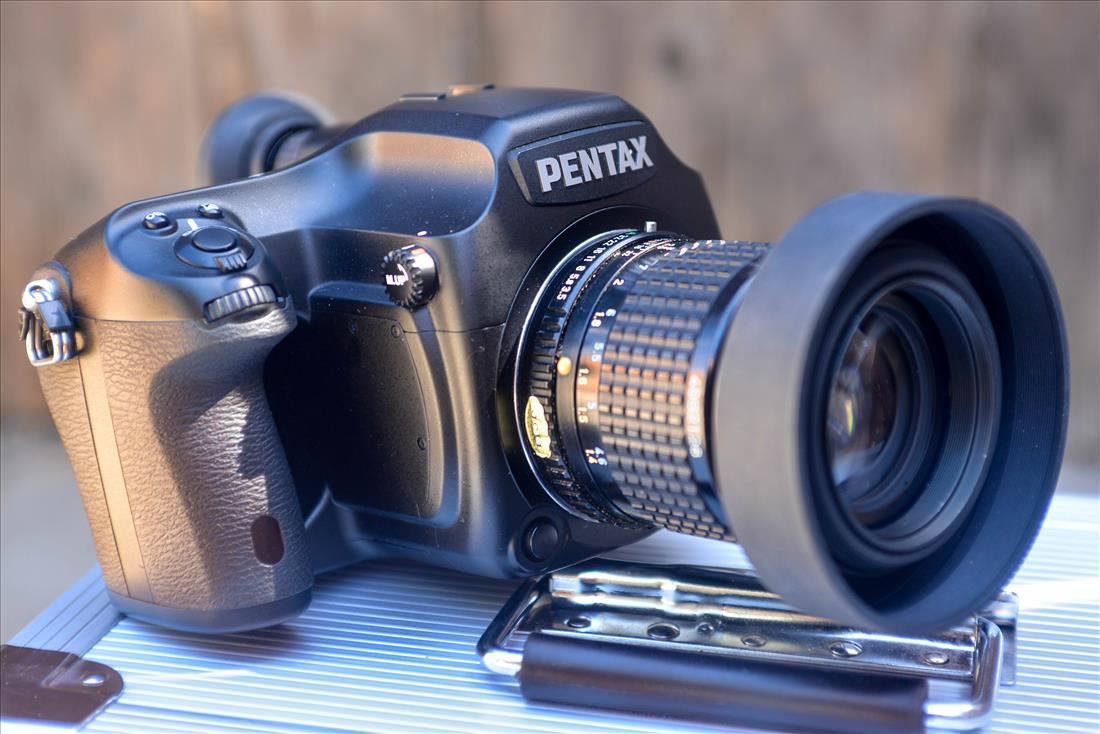
I wouldn’t normally write a full-scale product review, especially of a well-known piece of equipment; but when researching my purchase I found surprisingly few reviews of the Pentax 645D.  The camera is already a generation old—the impressive 645Z already garnering praise.  Recent price drops for the 645D suggest it’s about to be discontinued. Typically, you wouldn’t write a review of a product about to vanish, either. In this case, however, not only is the original model now available in the used market at less than half the cost, but I suspect it will attract a second­-generation following that will endure for another five years.  And while a few large websites and individuals have written (and uploaded video) reviews, I’m also surprised by the number of specific features, advantages, and disadvantages that have gone unmentioned.  So my review will be light on the general information available elsewhere, and focus on user experience and some of the unique features, quirks, and considerations that surprised me as a new owner.

This article should, in many respects, be considered a “Preview.” I’ve shot just two sessions with the camera so far-- a wedding (yes, my first camera-outing was an intensely demanding wedding, something I would never recommend) and a musician’s portrait.  In both cases I brought the 645D as my back-up, and between the two events I pressed the shutter maybe 200 times.  Total.  So my experience with the camera is fledging.

One must always understand that the camera, any camera, is a tool.  Full format DSLRs are remarkably versatile and designed to be almost identical in terms of use and output—there’s little difference between top of the line DSLRs-- so it’s not surprising that we forget that are tools designed for specific uses.  In this respect, it’s better to conceive of the Pentax as a lens... these we understand to have unique uses, strengths, and weaknesses.  The Pentax 645D is designed to slow you down, make you take fewer (and better) shots.  For a medium format it’s remarkably versatile, but it’s not the best choice as your “go to” for weddings, sports, or events.  In many of those situations the gorgeous sensor would be wasted; you’d see little difference between your full-frame and the 645D.  But in certain situations the images are a class above, and even the most mundane of subjects are transformed into a painter’s still-life.  

But to the details.  And with 40MP there are details to spare.

Build, Specs, Et Cetera
Much has been said about the Pentax 645D build, so I won’t repeat others.  Safe to say, it’s an impressive, heavy, ergonomically-intelligent piece of equipment.  It fits nicely in my hands, which are fairly large, and the heft helps to stabilize the unit—something necessary because neither the 645D or its lenses come with image stabilization.  If you’re a natural-low-light shooter, you should be aware of the lack of stabilization.  Despite the weight, the 645D is as comfortable to handle as my Nikon D600.

Operational Features of Note

The Green Button.  My god, why haven’t Canon and Nikon adopted this feature?  This programmable button, conveniently located near your thumb, can set the correct exposure automatically.  If you are in Manual mode and adjust your aperture, for example, the shutter speed adjusts automatically at the touch of a button.  Or your ISO, if you so choose.  It’s an incredible time-saver for manual mode shooters.
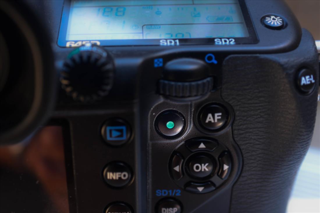

The ISO button is located right by the shutter release where frankly it belongs.  My Nikon D600 (a lovely camera) has ridiculously placed the ISO button in the lower left corner of the camera back.  As a part of the triangle of exposure, it should be where you can adjust it as easily as your shutter and aperture.  The Exposure Compensation button sits right beside the Green Button in its familiar place.  Your AE and FL lock buttons are smartly located on either side of your thumb.  These are all great.  I’m adjusting to the placement of the FL and Green button so close to each other; with my eye to viewfinder my thumb sometimes reaches to the wrong one.

What’s lacking?  It would be great if there were at least a couple of completely programmable buttons.  In my opinion, there’s no need for two dedicated buttons to set the image file type/size for each of the card slots; that should be in the menu.  And on top of that a button for RAW?  I’ve yet to figure out the value of that being at my fingertips.  Typically, I set my image characteristics before a session and don’t adjust. There’s plenty of real estate for buttons, so give us some other options.

Flash.  Here is the 645D’s biggest shortcomings.  First, its maximum sync speed is 125.  This is actually a bit painful considering the lowest ISO is 100-- and its native ISO is 200.  It baffles the mind why they would cripple the sync speed below the native ISO.  For those who want to over-power the sun, don’t bother with your speedlight; you’ll need pull out a big strobe and neutral density filter.  To add salt to the wound, there’s no ability to cancel the flash from the body. This is important for people who want to set the ambient light levels before adding the flash into the mix.  Yes, it’s another fine example of the camera telling you to slow down... turn off the flash at the source... take your test shots, but really?  If you have multiple flashes in your set up, you’ll need to cancel each one individually. I’ve programmed that function to my D600’s Preview Button.

Spot metering.  This is the first camera I’ve owned with spot metering so precise that you can use it for calculating exposure via the Zone system.  Point it at the brightest spot and darkest and you can calculate the proper exposure.  The spot metering area in my Nikon is too large to do this well.

Depth of field button.  I’ve never seen the value in this button.  Until now.  I think part of my problem has been I’ve always checked the depth of field when it’s shallow; you really see the difference-- and can appreciate the utility-- when it’s deep.  This is especially helpful with medium format because you have so much more control over focus depth.  This function can be mapped to your Off/On switch: pull it farther to the right and the mirror pops up.  The 645D also offers the option to view the depth of field as an image on the LCD screen.  This, however, doesn’t seem much better than just taking a picture.

Viewfinder.  If you’ve ready any reviews of the Pentax 645D you’ve heard it has a big, beautiful viewfinder.  I won’t contradict this (though I think it’s perhaps over-emphasized... if you have a good full-frame you probably won’t be that impressed).  The indicators in the viewfinder, though, are quite good.  First, an underline appears under the values (shutter, aperture, ISO) you can adjust in your current setting.  There’s a visual indicator-- and a beep-- when the image is in focus, and a clear “*” when your AE lock is engaged.  Very easy to read and intuitive.  I sometimes judge the skill of a photographer by their ability to make all of their adjustments with their eye to the viewfinder, and this one makes that easy.

Buffer.  Basically 1 image every second.  That’s how fast you can shoot.  Yes, this has been discussed extensively in other reviews, and blogs, forums, and comment areas.  Many people see this as a profound negative; I see it as the camera’s way of saying slow down....  Admittedly, it’s not good for sports photographers and nerve-wracking for weddings, but there was a time when professionals naturally worked at that speed and produced timeless results.  We need to learn to rely less on spray-and-rely-on-the-odds and work diligently to hone our craft.  It’s that kind of camera.  No matter how you look at it, though, the buffer speed will change the way you shoot and it’s important to consider.

Image write time.  This, too, has also been touched upon in many reviews but it’s important enough to mention:  it’s kind of a nuisance.  Expect to wait four seconds for an image to appear.  Then if you impatiently attempt to zoom in to check focus the image will disappear.  There’s an option that makes it possible to zoom during image preview (and you can do it in “play” mode of course), but it lengthens the write time.  Like the buffer speed, the image write time will also change the way you shoot because there’s no quick check or sharing with your subject.

Shutter life.  This disturbs quite a few people, myself included.  The estimated shutter life of the Pentax 645D is 50,000.  Compare that to the average professional DSLR which has a shutter life of 150,000.  That’s a big difference, given how much more you’re paying for the camera.  In all honesty, I’ve never reached 50,000 on a camera before selling it.  Admittedly, this is the first year I’ve shot as a full on “career professional” so I’m racking up the shutter count, but I still expect 50,000 to be a five year endeavor on my primary camera, the Nikon D600.  And replacing the shutter mechanism isn’t the same as replacing the camera.  The Pentax asks you to be more thoughtful, to slow down.  There’s no five-frames-per-second option.  I expect that 50,000 tombstone will take me seven years or more.  Others will get there quicker, either because their work is more demanding or their style less respectful of the camera’s quiet request.  Shutter life is something to consider.  Two months into my experience as a “career professional,” devoted to making money at my craft, I decided I needed to take fewer images per session in order to really master my craft.  I made my decision independent of Pentax.  The 645D just reinforces it.

Lenses.  Unless you already own one of the film versions of the Pentax 645, you’ll need to factor in a new set of lenses.  The good news is beautiful, manual focus versions of the Pentax 645 lens series are available for a song, many of them under $250. The camera beeps and flashes when you’re in focus, so there’s not a huge difference between the manual and auto capabilities.  Auto focus lenses get pricey quickly, but you can acquire a range of very good lenses for about $400 each.  Top of the line lenses are like any other brand... in the thousands.  The other good thing about Pentax lenses?  They didn’t make that many different types.  Three or four lenses and you’re set (I’ve got eight Nikon lenses in my drawer, half of which I don’t use).

Performance Issues

Image Quality & Sensor Size.  Much has been written on this subject as well. Medium format images are, at times, quite similar to full frame images.  In other circumstances they take on a quality that cannot be produced by a smaller sensor or recreated in Photoshop.  The sensor in the Pentax 645D is smaller than a traditional 645 format, and it’s the smallest of the medium sensor formats.  Several expensive medium format camera’s use the same sensor.  Some photographers who are obsessed with the physical size of the Pentax 645D sensor incorrectly assert that the Pentax isn’t big enough to make a real difference.  I say let them stick to their theoretical guns.  In reality, the quality difference is easy to see in the 645D and as dramatic as the leap as transitioning from a crop sensor to a full frame.  

ISO.  The maximum ISO is 1600.  Compared to the newest DSLRs, this is low (compared to film, frankly I never shot above 400).  However, only in the worst of pinches would I set my Nikon D600 above 2000 because there’s just too much noise for a professional image.  Above 2000 I’m essentially committing to either a “documentary” color image or an art Black-and-White.  Or a 4x6 print that could have been taken by Aunt Sally due to the grain (or blur from noise reduction) and compressed dynamic range.  While the Pentax isn’t more sensitive than 1600, the noise it creates at that ISO is comparable to the noise my Nikon produces at 1,000.  That’s pretty awesome. It also opens up the possibility of underexposing the image at ISO 1600 and correcting in post.

Street photography, sports, and events.  These three have a common need for quick, spontaneous image taking.  I’ve been upfront about the Pentax as a camera designed to slow you down, but it’s not as simple as that.  Certain features, like the Green Button, speed up the process.  In my opinion you can use the 645D for street photography, but the camera draws a lot of attention.  It’s big, eye-catching.  And on a per-image basis, comparatively expensive to shoot. Remember, you only have 50,000 shutter actuations on a camera that goes for $6K new.  You don’t want to waste those on blurry, poorly composed street images, so it’s a thinking-photographer’s street tool.  Sports:  I wouldn’t.  It’s just not fast enough.  Events: Yes, keeping in mind the same considerations you would have in shooting on the street.


Conclusions
If the images are both dramatic and sometimes indistinguishable from a full frame DSLR, who is this camera for?  At $10,000 I would have found that a difficult question.  Currently, though, the 645D is selling at $6K new, $4.5K used.  A Nikon D810 costs $3,300 new and a used D800 runs about $2.4K.  There’s a significant price difference between the two, but also a significant difference as tools.  Previously, I used a Nikon D7000 as my back-up camera.  A decent choice—the D700 is a small step down in image quality but still professional.  However, unless my D600 tanked during a session, it would never come out.  And the D600 never tanked.  I purchased my Pentax for $4K with under 5,000 shutter actuations.  As a back-up the Pentax risky because it can’t do everything the D600 can.  Or at least not as easily.  But it also comes out during my sessions to add value to the work I am creating, something the D7000 never did; it was a $1200 insurance policy.  Right now, at the current price point, the Pentax 645D is a good choice for a professional who wants to expand into medium format images.  I would not choose the 645D as my sole camera as a professional (well, maybe if I was a wealthy amateur)... unless I was a professional landscape photographer.  For other types of photography it doesn’t have the required versatility.  As a second camera-- which all professionals must have-- it’s a choice that enhances your toolbox.

Tuesday, September 2, 2014

Nicefoto 680W Strobe Review: An inexpensive, muscle-bound, wireless strobe


I pretty much never review products.  Mostly, this is because I rarely buy the newest, hottest gear.  I’m a big fan of top quality goods that are already a generation old:  my bag is stuffed with gems like Nikon 80-200mm f/2.8, the 35-70mm f/2.8, and SB800s.  But I’m making an exception today, both because the product is fairly new, but also because I think it’s an exceptional deal.

I posted earlier about lighting alphabet soup, which was essentially a summation of my purchasing criteria.  I wanted a bigger strobe than my SB800s, one that could compete with the sun outdoors.  I settled on the Nicefoto 680W.  “Nicefoto” isn’t the most confidence inspiring name to emerge from the smoky factories of China, but I’d read some good things about it and the specs were excellent.


The Nicefoto 680W is equipped with a rechargeable battery that other reviewers have found to get 400+ flashes at full strength. It comes with both an optical trigger and a built in 2.4GHz radio trigger.  The power goes from full to 1/64 in full stop increments.  There’s a modeling lamp, and cooling system.  And it utilizes IGBT technology, which means the flash has a very short T.1 time (up to 1/7,900th of a second) for freezing the action.  Great specs, and at $420 a good price, but how well does it perform?


Features and Build
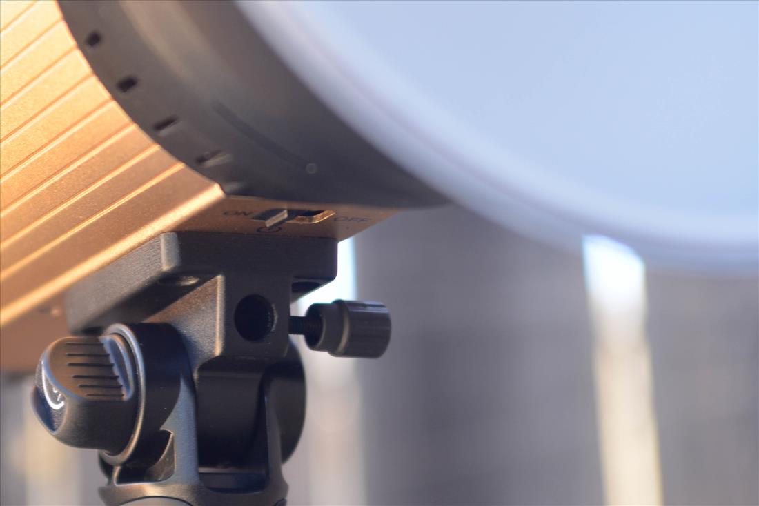
First, 680 watts is blindingly bright.  There’s more than enough power for most people.  The unit is built very well-- very sturdy, well thought-out, fairly heavy, and all the parts fit together snugly.  It feels, in short, muscle-bound.  The Nicefoto has a host of thoughtful little features, too.  There’s a handle that folds down for your human light stand, and a hole with tightening screw for attaching to a non-human light stand. It also has a second small handle that flips out from the top to make it easier to hold while attaching to said stand. There’s strap, a cold shoe to clip your radio trigger, and trigger input.  The LCD is large and bright, and the button-interface simple. The only misstep in the design is the umbrella holder, which is at the top of the handle. The reflector and the umbrella post collide, making it impossible to use both at once.  


Considering how much thought went into the rest of the unit, it’s baffling and there’s no elegant work-around.  The reflector is a Bowen mount, though, which means there are plenty of attachments available (including reflectors with umbrella holes).


Both the optical and radio triggers work well.  It would have been nice if you could control the output from the trigger.  Another odd over-sight.  The trigger appears to be universal (it works on both my Nikon and my Pentax) and has a pass-through, which is a great bonus. I can control my other strobes from the camera. The simplicity makes it easy to use, quick to set-up, and really a joy so far.  The modeling light is decent for checking your shadows, but too weak for anything else; it’s daylight temperature, just in case 35 watts is enough for your project.

Quality of Light
Independent testing by the folks over at www.lightingrumours.com verify that the color temperature is 5600; it rises to a slightly bluer 6300 as you decrease the power to 1/64th.  That’s pretty accurate in my book.  Recycle time is about 4.5 for a full pop, and the output is consistent.


Like your hotshoe flash, the IGBT flash times shortens as the power decreases.  In regular mode, the flash time decreases from 1/320th  at full to 1/7,600th of a second at 1/64th power.  There’s a FP mode for that clips it even sharper-- again with a commiserating loss of power.  There are five FP settings, the slowest (1/2000) is equal to about ¼ power.  The fastest (1/7,500) is pretty dinky.  Here’s the confusing part for me.  In my initial tests, the FB mode doesn’t appear to be any faster than the regular mode:  at ¼ power the flash fires at 1/1,600th of a second in regular mode.*  That’s virtually the same as the FB mode.  The FB mode appears to be a placebo for the most part, but it’s hard to complain because 1/7,500th of a second is very fast.

You’ll notice I haven’t mentioned HSS, only FB.  These two terms have merged into something synonymous and they’re not.  Frankly, I’m not sure what FB refers to anymore.  The 680W has an FB mode designed to reduce the flash duration.  HSS, on the other hand, greatly “lengthens” the flash duration by turning it into a serious of rapid pulses.  HSS is slightly more useful because it allows a faster shutter speed, thereby reducing the ambient light.  With “FB” (or a short flash duration) you use ND filters to reduce ambient light. The Nicefoto doesn’t have HSS capability, but it does have multi-flash, which allows you to program multiple distinct flashes for long exposure photography. It’s use, for example, is to show five distinct moments of a dancer’s movement without photoshop.

Conclusion
All in all I’m impressed with the Nicefoto 680W, and I’m looking forward to spending some time with it in the field.  The wireless design and handle makes it very efficient, and it performs just as promised.  Comparable strobes costs $100-$400 more, which is why I decided to post a review.


*I’m metering the light output and utilizing the flash duration charts supplied by Nicefoto.